In Part 1 of this two-part series, I described how building narrative into a user interface (UI) helps users to better comprehend its workflows, navigational cues, and calls to action (CTAs) because humans are hardwired to respond to stories—not to complex systems. I described the following techniques for intentionally creating narrative in a user interface:
imposing sequence
using parallel structure
highlighting one-off elements
foreshadowing things to come
culling or relocating backstory
Now, in Part 2, I’ll pick up the story where I left off—pun intended—and present the following techniques:
invoking appropriate consequences
reinforcing themes
maintaining a consistent tone
providing clear orientation clues
Champion Advertisement
Continue Reading…
Invoking Appropriate Consequences
In most works of genre fiction, authors create an inciting incident that triggers a consequence for the main character, launching that character onto a journey. For example, a consequence could be a character’s internal reaction to an incident or the actions the character takes as a result. However, authors would frustrate their readers and even risk losing them if they created consequences that would feel disproportionate to the incidents that triggered them or were contrary to the way a character would normally react to them.
Similarly, the consequences of the actions that our user interfaces trigger must also feel proportionate and appropriate, or they’ll confuse and frustrate our users—potentially causing us to lose them as well. You’ve probably performed tasks on Web sites and in applications whose resulting feedback or consequences felt lopsided. Of course, not providing enough feedback on something users do could trigger anxiety, making them wonder whether they’ve successfully completed a task and potentially leading to all kinds of negative consequences if they attempt to try completing it again. In contrast, providing too much feedback in a user interface would annoy and frustrate users because it wouldn’t feel proportionate to the work they’re doing.
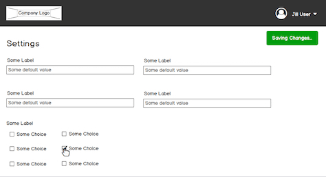
For example, earlier this year I consulted with a developer who was implementing an autosave feature in a settings workflow, which would preserve users’ work without their needing to click a Save button. To reduce users’ anxiety about safely preserving their work, I proposed that we display dynamic text in a specific location in the user interface that was reserved for global messaging, giving users a continual sense of what was happening. For instance, if a user made a change to the settings—such as selecting a checkbox or entering a value in an input field, the text would say: Saving changes…. Then, once the backend system had preserved the user’s work, the following text would appear: Changes saved. However, the manner in which the development team had implemented these transient messages made the autosave feature a nuisance rather than a help because they had repurposed a Toast notification component to display the text, and it drew too much attention to itself. As Figure 1 illustrates, the green notification appeared constantly, for every change users made. The animated display of the Toast notification, which slid down from the global navigation bar, drew even more attention to it and further exacerbated users’ annoyance.
Figure 1—Example of a distracting autosave text notification
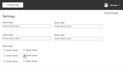
To address this issue for a workflow in which users could make many changes during a single work session, we opted for innocuous dynamic text that is more proportionate to the actions that trigger it, as shown in Figure 2.
Figure 2—Example of autosave text that is more proportionate
Invoking consequences that feel appropriate or proportionate to the actions that trigger them enables users to better trust your user interface and experience less anxiety and makes them more likely to stick with their tasks and ultimately finish them.
Reinforcing Themes
In literature, the theme of a book is the big idea or lesson the author explores within its pages. Authors rarely explicitly state a book’s theme, but astute readers can easily perceive it. Moreover, a strong theme has the power to stay with readers long after they’ve read a book. Similarly, users can readily perceive a user interface’s theme, which can also have residual effects.
Dismissing the importance of theme can have surprising consequences. In 2018, I led a usability study for which we recruited users to test a new application that augmented the already extensive capabilities of Logix Designer—Rockwell Automation’s flagship productivity software—which had been in production for decades. The application we were testing used new, Web-based technology, making the experience more accessible to people using a wide variety of device form factors. In addition to using new technology, we had also decided to modernize the application’s visual theme and style, making the application the first of many new applications to which we would apply the same visual theme and style.
Most participants didn’t seem to mind the new visual theme when we asked them about it during testing. However, one participant’s response still stands out boldly in my mind. Ignoring the printed introductory scenario we’d given him to read, he immediately turned his attention to the user interface that appeared on the computer monitor, leaned back in his chair, and said something like: “What’s this? This doesn’t look like a Rockwell Automation application. It’s nothing like Logix Designer. Why would I trust it? I’ve been using Logix for twenty years now, and this looks like it comes from a different company.”
At that time, Logix Designer and its adjacent applications and utilities all shared a similar visual theme that reflected the look of s traditional Microsoft Windows desktop application. This participant’s negative reaction to the new application’s aesthetic treatment stemmed from the fact that it was thematically inconsistent with our older applications, so it failed to capitalize on the equity of the Rockwell Automation brand, which had accumulated over a span of decades. The fact that there were some cross-application workflows between Logix Designer and the new application further exacerbated the problem by making inconsistencies even more obvious.
This was the first time that I’d ever witnessed a participant—who happened to be an engineer—reacting so palpably to theme. After interviewing this participant, we altered our questions for the remaining participants, so we could gauge their thoughts on the differences between Logix Designer’s theme and the new application’s theme. We heard very similar sentiments from other participants. While we eventually moved forward with the new Web technology, we more closely examined areas in which we might have been dismissive of users’ existing knowledge and perceptions of our established products’ visual themes. For example, we tweaked the minimalistic, text-only buttons we’d implemented to make them more reminiscent of Logix Designer’s Windows-style buttons, with text labels inside boxes. We also changed all input fields to look and behave more like Windows’ default input fields and reviewed other minor visual inconsistencies that we thought might confuse users with deep knowledge of Rockwell Automation’s legacy products. Such inconsistencies would serve only as decelerators and obstructions—if they did not improve the user experience in some meaningful way.
By striving to reinforce theme—regardless of an experience’s underlying technology or UI component library—we can help ensure that we reward people’s repeated use of our user interfaces with consistency. Moreover, just as strong literary themes have the power to stay with readers, strong UI themes have the power to reinforce residual loyalty in users.
Maintaining a Consistent Tone
For works of fiction, authors maintain a consistent tone to help deepen readers’ interest in a story. Once readers have invested their time in reading a story, you can reward that investment through their growing familiarity with the story’s characters and the world they inhabit. In addition to readers recognizing characters’ unique voices, it is just as important that they know the author’s voice—regardless of whether that voice comes across as loquacious, laconic, or something in between—because an author’s consistent voice fosters a smoother, more unified reading experience.
Similar to reinforcing a consistent theme throughout a user interface, it is also critical that you maintain a consistent tone because people who have already used your software want the reward of their becoming familiar with it. As I mentioned in a previous column, “Molding Yourself into a Leader, Part 1,” the copy that we rough into our UI designs often finds its way into production—even when there are information developers and technical writers on a project. I recently had a discussion with a software engineer who was implementing a setup workflow that I’d designed for a Windows-based utility. This engineer felt that our using a conversational tone for the workflow would better humanize the user experience, making it feel more approachable. At first glance, I appreciated the text he’d roughed into the latest build. It was memorable. As I mentioned in Part 1, injecting personality into an experience resonates with users and can help them remember it.
However, the text he’d roughed into the utility wasn’t consistent with the program that would launch that utility, whose text uses a more objective tone. As UX designers, we’re often put into positions in which we must choose our battles. As much as it would have been great to create a memorable experience by using the casual tone the engineer suggested, doing so would have made the utility feel out of place in its surrounding environment, as well as its upstream and downstream workflows. So we ended up rewriting the utility’s text to be consistent with its context, reinforcing to users the fact that they were experiencing an integrated system from one company.
Just about every large enterprise is made of business units, divisions, departments, programs, and feature teams that are responsible for different parts of a software user experience. Such divisions often create scenarios that are rife with inconsistencies because no one is overseeing users’ workflows from a holistic perspective. The people who use our products do not care—nor should they care—about our companies’ internal organization. However, failing to create seamless experiences makes a company’s inefficiencies and its feature teams’ unilateral decisions blatantly obvious.
Just as a ghost writer endeavors to make a book’s tone and voice consistent with that of its putative author—enabling readers to benefit from their familiarity with that author—so too should UX designers endeavor to keep the tone of the software they design consistent, building fidelity with users and rewarding them for their loyalty to and investment in a brand.
Providing Clear Orientation Clues
A reader cannot slip into the skin of literary characters if an author fails to adequately portray their environment and their place within that environment. It is also important that readers understand the journey a character has taken to arrive at the place in which they currently find themselves—the path that has shaped who they are and why readers should care about them—as well as where they ultimately want to go—their ultimate goal.
Giving users a sense of place and an ultimate destination within a user interface helps them to orient themselves better, leading to a more comprehensible, linear experience. If you orient users effectively, their journey through a user interface unfolds like a story, which may include several inciting actions along the way, and helps them arrive at their desired destinations. Moreover, visually indicating the path that the user has already taken fosters momentum and confidence, while revealing where the user should ultimately go reduces anxiety and fuels motivation—as I described in the section “Imposing Sequence” in Part 1. It is important to provide visual clues to users that show them where they’ve come from, where they currently are, and where they should go next—which is a key driver of conversions.
There are many ways of orienting users within a user interface. For example, as shown in Figure 3, the bold Condo label on the Nationwide Web site’s fixed navigation bar—which remains in place as users scroll down the page—clearly shows that the user is in the “Condo” section of the site. Plus, the Get a Quote button—which leads to the destination to which many users would ultimately want to go—is spatially proximate, helping users not only to orient themselves within the experience but also giving them a clear visual clue regarding what they should do next if they’re interested in condo insurance. Users won’t need to look elsewhere to connect the dots of their journey because they’re prominently displayed within the user interface, in what feels like a natural linear sequence.
Figure 3—Fixed navigation bar on the Nationwide Insurance Web site
While many Web sites and applications provide breadcrumbs to indicate a user’s journey through a user experience, very few clearly and contextually signal what the user should do next. Within literature, characters’ ultimate goals drive their actions and behaviors. While their experiences and the journey they’ve taken shape them, their ultimate goal is always on their mind, and their actions reflect that or becomes manifest through their dialogue with the other characters. Their goal is their north star.
When you’re considering a Web site or software application that you’re designing, what do you want your users ultimately to do? Can users get a sense of where they’ve come from, where they currently are, and—most importantly—where they should go next? While many ecommerce Web sites have become adept at driving conversions—by displaying clear calls to action such as Get a Quote—those of us who design productivity applications and task-based systems should have the same incentive: converting a user’s tasks from a state of to do, then doing, and finally, to a state of being done. By ensuring that users’ north star is ever present over their greater journey, we can orient them to their work, reduce their anxiety, and motivate them to finish their tasks. Conversion should be the goal of every software user experience, regardless of its purpose.
Conclusion
Deliberately building narrative into the user interfaces that you design helps users understand an application’s purpose and how they should go about completing their tasks and goals within it. Humans respond to stories better than to complex systems.
Let’s quickly review the techniques I’ve shared in this column. Invoking appropriate consequences makes users better trust your user interfaces. Failing to do so makes user experiences feel lopsided, perpetuating users’ anxiety and confusion and potentially causing them to abandon your user interface. Reinforcing theme rewards users for their investment in your products. Plus, a strong theme has the power to stay with users beyond working with your products. Maintaining a consistent tone further deepens users’ familiarity with a holistic brand that manifests through a company’s user interfaces. Because users likely do not interact with your individual user interfaces in a vacuum—which is especially true across system-level experiences—you should closely attend to keeping their tone consistent. Finally, providing clear orientation clues gives users a sense of place and directs them toward their goals. Identify the north star of your Web site or application and ensure that users can readily orient themselves to it, because the intent of every software experience is some kind of conversion.
Director of User Experience at Rockwell Automation
Cleveland, Ohio, USA
Jon has a degree in Visual Communication Design from the University of Dayton, as well as experience in Web development, interaction design, user interface design, user research, and copywriting. He spent eight years at Progressive Insurance, where his design and development skills helped shape the #1 insurance Web site in the country, progressive.com. Jon’s passion for user experience fueled his desire to make it his full-time profession. Jon joined Rockwell Automation in 2013, where he designs software products for some of the most challenging environments in the world. Jon became User Experience Team Lead at Rockwell in 2020, balancing design work with managing a cross-functional team of UX professionals, then became a full-time User Experience Manager in 2021. In 2022, Jon was promoted to Director of User Experience at Rockwell. Read More
