Top

Effective Use of Color and Graphics in Applications for Children, Part I: Toddlers and Preschoolers

Designing for Children

Early engagement in the digital world

October 3, 2011

While most of the content and interactive elements in applications for children employ graphic components and vibrant color combinations, the way in which application’s combine these elements can lead to a great user experience or be a cause of frustration and confusion.

This column is a continuation of my last Designing for Children column, “Effective Use of Typography in Applications for Children.” In this column, I’ll discuss the optimal use of color and graphics when designing digital applications for kids between two and five years of age.

Champion Advertisement
Continue Reading…

Appropriate Graphic Styling for Children’s Color Perception

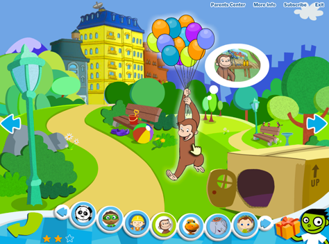
Younger children, in the range of two to three years old, generally prefer bold, primary colors and high contrasts in graphic layouts that evoke exploration and discovery. An example of this is the Curious George section of the PBS Kids Play! Web application, shown in Figure 1.

Figure 1—Graphic styling in Curious George on PBS Kids Play!
Graphic styling in Curious George by PBS Kids Play!

The background illustrations are generally very colorful in such layouts, which create an immersive and exploratory experience for children. However, it is still important to maintain a visual hierarchy and emphasize elements that are interactive. You can achieve this by making clickable or tappable elements bigger, adding subtle drop shadows or contour lines, or using a broader color palette than the one you’ve used in the background graphics. Additionally, in applications for children, audio and animation cues generally accompany such visual emphasis, prompting users to action.

In the example shown in Figure 1, note specifically that there are three types of navigation systems, and the use of graphic elements in each of them differentiates them from one another. The navigation graphics in the park area have the same look and feel as the static graphic elements, providing a unified look. At the bottom of the page, the navigation for choosing characters uses a more elaborate 3D look, with bold white contour lines to call attention to this different area of the page. Finally, the navigation for parents or caregivers uses simple text links in the upper-right corner of the page. Most likely, younger users would ignore these.

Children’s attraction to bold colors and high contrasts extends all the way to their fifth year. However, recently, children’s tolerance for broader color palettes, more complex textures, and more advanced levels of depth has increased—largely because of the now very common use of computer-animated, 3D graphics in movies and TV shows for young audiences.

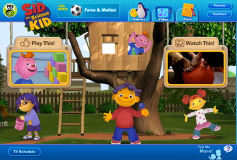
This is the approach that the Sid the Science Kid Web site takes, which is also part of PBS Kids product family and has the same look and feel as the TV show, as shown in Figure 2.

Figure 2Sid the Science Kid Web site by PBS Kids
Sid the Science Kid Web site from PBS Kids Play!

When using this kind of styling, the background elements usually have as many intricate graphic details as the main navigation elements. Therefore, it is very important to keep layouts as clean as possible and maintain an effective visual hierarchy. Young users should always be able to discern where to click or tap—or at least where to start exploring an application, regardless of the style of the highly immersive graphics in a layout’s background and foreground.

In the example shown in Figure 2, the main navigation elements are in the center of the page, and their size is bigger than that of interactive elements at the top and bottom of the page. Although the designers have made use of detailed background graphics, they’ve also used dark shades and subtle spotlights to differentiate static elements from interactive components.

This Web site also differentiates its primary and secondary navigation through their different background colors, location, size, and general look and feel. The highly immersive, graphic navigation elements at the center of the page draw users’ attention to what the page’s designers want users to explore first; while the secondary navigation areas at the top and bottom edges of the page use simpler background textures and smaller sizes.

Visual Design in Mobile Applications for Children

In mobile applications for children, there are many ways of displaying graphics and interactivity—from the highly sophisticated computer-animated graphics of The Fantastic Flying Books of Mr. Morris Lessmore for iPad, by MoonBot Studio, shown in Figure 3; to graphics that take their inspiration from real life in Toca Robo Lab by Toca Boca, in Figure 4; to the clean, vector graphics of illustrations for applications like Tickle Tap Apps by Zinc Roe, like those shown in Figure 5.

Figure 3—Highly realistic computer graphics in The Fantastic Flying Books of Mr. Lessmore iPad app by Moonbot Studios
Highly realistic computer graphics in The Fantastic Flying Books of Mr. Lessmore iPad app by Moonbot Studios
Figure 4—Graphics based on real-world scrap materials in the Toca Boca Robot Lab iPad and iPhone apps
Graphics based on real-world scrap materials in the Toca Boca Robot Lab iPad and iPhone apps
Figure 5—Minimal vector graphics in the Tickle Tap iPad and iPhone apps by Zinc Roe
Minimal vector graphics in the Tickle Tap iPad and iPhone apps by Zinc Roe

In general, the age of the audience you are trying to reach, the theme of your application, and the types of activities you want users to perform should determine the look and feel for your applications. However, when designing applications for mobile devices and young children, you also need to keep the following considerations in mind:

  • designing immersive experiences—Because of the high-resolution rendering capabilities of devices like iPad, both children and their parents or caregivers have learned to expect immersive experiences that include high-quality graphics and animations. This is an important point that you should not take lightly. Furthermore, it’s important to implement visually rich applications for efficient performance. Although many mobile applications for children are beautiful and fun, they may take a while to load, causing immediate frustration to young users who are eager to play. [1]
  • designing for small screens—The smaller screen real estate of mobile devices calls for a higher emphasis on graphics for the main navigation elements, cleaner layouts and backgrounds, and less complex conglomerations of features. Most toddlers and preschoolers want to explore and interact with apps quickly, but don’t have a specific task in mind; therefore, your design should be playful and exploratory, but uncluttered and focused. Always think twice before including things like company logos, settings and other options, menus or secondary navigation elements, and graphics that are not part of the task at hand.
  • designing for autonomous use—Unless you specify otherwise, assume children will use your application without the help of an adult. Thoroughly test the usability of your mobile app with your target audience. Check that the size of interactive elements is adequate for preschoolers’ fingers and motor abilities, so they don’t accidentally tap buttons that would take them away from their current experience and cause frustration.

Images, Graphics, and Icons

Toddlers and preschoolers are very literal in their interpretations of the icons and images that provide calls to action in interactive applications, as well as in their expectations of what will happen when they click or tap them. For example, while young children are able to associate back and forth arrows with navigation systems, they might not be able to extrapolate the meaning of a home button or a floppy disk icon, which are so common in the adult digital world.

Continuing with the Sid the Science Kid example, we can take a look at the top navigation bar on the site, shown in Figure 6.

Figure 6—Navigation bar on the Sid the Science Kid Web site
Navigation bar on the Sid the Science Kid Web site

In this example, the Video icon is clearest. Most children can relate to the screen and musical notes graphics. The book and crayon image is also a standard icon. However the label Print might be confusing. If young children are not able to read or print pages by themselves, the icon might lead them to think they could interact by coloring pages directly on the computer, and they might become frustrated when they discover that the coloring feature is available only for printed pages. The Games icon would lead to ambiguous interpretations. Some children might understand it, but others would be confused by it.

The Nick Junior Web site, shown in Figure 7, uses a similar navigation bar, but with some subtle differences in the icons’ graphics. An interesting idea is the use of a gaming console controller graphic to represent the Games section, which might be more in tune with digital natives’ mental models. However, users younger than four years old might not be able to understand the metaphor.

The same situation occurs with the use of a Home icon. Although this a common reference on most Web sites, it might not provide a clear literal reference that matches children’s mental models. This is specially true when we are dealing with very young kids who are just getting started with digital technology or children who have experienced other forms of navigation through game consoles, virtual worlds, or mobile apps.

Figure 7Nick Junior Web site
Nick Junior Web site

Both of the previous examples combine labels and icons in their navigation bars. This is a good practice to accommodate different developmental stages: Very young children from three years of age and below are not interested in text labels and navigate through an application almost exclusively by using icons. However, as kids approach their fifth year, they become more interested in reading and writing words and welcome the opportunity of matching the meaning of a word with its corresponding image. It is important however, to keep your use of language simple. If possible, try to reduce labels to only one descriptive word.

As shown in Figure 8, the Barney and Friends Web site navigation uses labels and highly colorful graphics as well, but the way it displays the graphics might cause confusion to children. The visual hierarchy is unclear, and the background elements could easily be confused with interactive components. Plus, only the musical notes graphic is a clear match with the label Music. All of the other labels seem disconnected from their graphics.

Figure 8—Navigation system for the Barney and Friends Web site
Navigation system for the Barney and Friends Web site

It is vital that you test the icons you’ve chosen with your target audience, as well as other possible alternatives, to verify that the correct meanings come across clearly. You might also conduct early user research or participatory design sessions, during which you could ask children to draw images relating to the labels you plan to use in your application and thereby get a better grasp of the kids’ mental models. Children’s expectations, familiarity with technology, and mental models change rapidly over time, so it is important to constantly verify that the icons you’re using are still culturally relevant through testing.

Some common practices in the use of icons in applications for preschoolers include the following:

  • Conventional graphics such as pencils, books, and arrows that go back and forth are well understood by children on both the Web and mobile devices. Arrows can be somewhat abstracted, as in the triangular shapes in the Nick Junior example.
  • Common media icons such as Play, Pause, and Stop buttons are also generally understood by children, mostly because of their familiarity with media players and their widespread use of media Web sites like YouTube.
  • Short action words like Play and Go are also generally understood by younger users.

Some Final Thoughts

The effective use of color and graphics in children’s media is one of the most important aspects of design to ensure that you deliver optimal content and a memorable user experience to young users. In this column, I’ve provided some design guidelines that you should take into account when working on digital applications for young children—especially toddlers and preschoolers.

This is the first part of a series that I’ll dedicate to the exploration of color and graphics. In the next installment, Part II, I’ll dive into similar explorations of applications that are targeted toward older children. 

Endnote

[1] Wroblewski, Luke. “Touch-Based App Design for Toddlers.” LukeW Ideation+Design, August 18, 2010. Retrieved September 19, 2011.

References

Fishel, Catharine. Designing for Children: Marketing Design That Speaks to Kids. Minneapolis, MN: Rockport Publishers, 2001

Hourcade, Juan Pablo. “Interaction Design and Children.” Foundations and Trends in Human-Computer Interaction, Vol. 1, No. 4, 2008. Retrieved September 19, 2011.

Lazaris, Louis. “Designing Websites for Kids: Trends and Best Practices.” Smashing Magazine, November 27, 2009. Retrieved September 19, 2011.

Nielsen, Jakob. “Children’s Websites: Usability Issues in Designing for Kids.” Alertbox, September 13, 2010. Retrieved September 19, 2011.

Bishop, Chris, Rick Pinchera, and Silvia Lovato. “Designing Stuff Kids Will Use and Love (Podcast).” SXSW, March 12, 2010. Retrieved September 19, 2011.

Senior User Experience Researcher & Manager at Google

San Francisco, California, USA

Catalina Naranjo-BockA UX designer and researcher, Catalina specializes in the development of ideal experiences for children and young audiences for both tangible products and interactive applications. She has collaborated on children’s media and toy design with creative departments in numerous firms, in the US, Europe, and South America. In a variety of design-related contexts. Catalina has served as adjunct faculty, guest speaker, invited author, and international juror. Catalina holds a BFA in Industrial and Digital Design and an MFA in User Experience Design and Research from The Ohio State University.  Read More

Other Columns by Catalina Naranjo-Bock

Other Articles on Designing for Children

New on UXmatters