Top

Effective Use of Color and Graphics in Applications for Children, Part II: Kids 7 to 14 Years of Age

Designing for Children

Early engagement in the digital world

December 5, 2011

I dedicated my last Designing for Children column to exploring the effective use of color and graphics in interactive applications for toddlers and preschoolers. In this installment, I’ll continue my exploration of the use of color and graphics, but this time, in applications directed toward older children.

Champion Advertisement
Continue Reading…

The I’m-Not-a-Baby Stage: 7 to 10 Years of Age

Between the ages of 7 and 10 years of age, most children are entering a process of self-definition. Even though their motor, physical, social, and cognitive skills are still developing, kids of this age focus on discovering their favorite activities, artifacts, colors, and friendships. Designs for these older children can include emotion and more extreme colors and graphics, as well as more abstract elements that invite these young viewers to complete a picture.

There is a marked preference for digital games at this age, and older children start to become accustomed to edgy, heavy, extremely immersive layouts that use color and graphics in a variety of ways. As a result, kids of this age can tolerate—and may even expect—more detailed, deeper designs that they may describe as cool and not for babies.

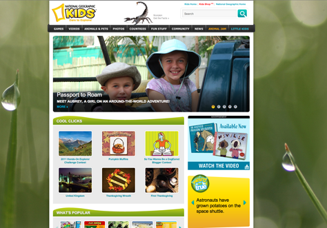
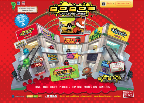
However, there is a fine line between providing an edgy, inviting design and causing cognitive or sensory overload through the excessive use of color or graphics that detract from an application’s main content or the actions users perform with it. Consequently, in terms of graphic styling, a content-focused Web site such as the National Geographic Web site for kids shown in Figure 1, whose aim is to inform children about a variety of topics relating to global awareness and conservation, should differ greatly from a toy-inspired Web site like Gogo’s Crazy Bones, shown in Figure 2, whose purpose is to advertise Crazy Bones products, along with games and other activities based on these toys.

Figure 1—National Geographic Web site for kids
National Geographic Web site for kids
Figure 2—Gogo’s Crazy Bones
Gogo’s Crazy Bones

Gender Differences

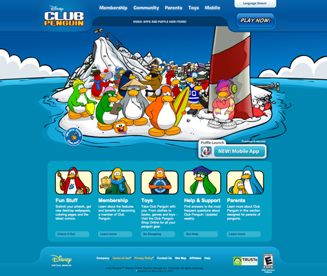
Gender differences start emerging strongly in older children, so it is important to keep your use of color and graphics gender neutral if your application must appeal to both boys and girls. Disney’s Club Penguin, shown in Figure 3, is a Web site that does a good job of appealing to both boys and girls, who use the site in similar ways.

Figure 3—Disney’s Club Penguin
Disney’s Club Penguin

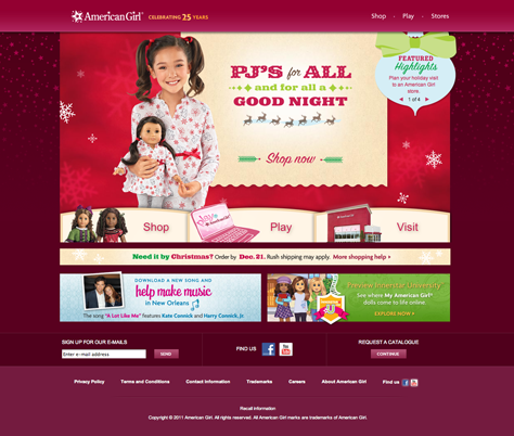
Although designers should be careful not to reinforce gender stereotypes through their choice of colors and graphics, there are particular Web sites and applications that appeal to one gender over the other. For example, dress-up dolls, fashion, and jewelry are very popular among girls, but not with boys. [1] Applications for older girls tend to use combinations of warm and pastel colors with either soft or strong contrasts. Mattel initiated this trend in its graphic design for Barbie doll packaging and accessories. The American Girl Web site, shown in Figure 4, aims for a combination of classic and contemporary aesthetics, without giving up the traditional pink that Barbie doll packaging introduced.

Figure 4—American Girl Web site
American Girl Web site

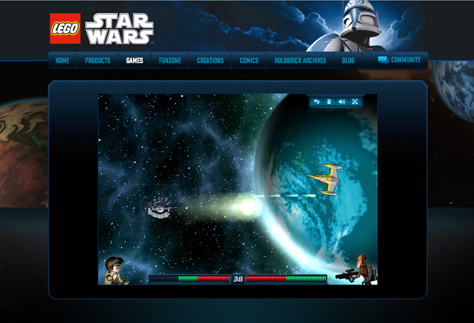
On the other hand, Web sites and applications for older boys tend to employ cold colors for backgrounds, high contrasts with warmer colors, and asymmetrical shapes, evoking fast movement, extreme emotions, or futuristic scenarios. Preferences for sports, cars, movie themes, and similar subjects start emerging at this age. Therefore, older boys like colors and graphics that evoke feelings and aesthetics relating to these subjects. A good example of this style is the LEGO Star Wars Web site, shown in Figure 5, which uses atmospheric, high-definition graphics and subtle shadings, evoking a dark, futuristic atmosphere that is in line with the aesthetics of the movie saga.

Figure 5—LEGO Star Wars Web site
LEGO Star Wars Web site

The I’m-Not-a-Kid Stage: 11 to 14 Years of Age

In their tween years, children reach a stage at which they feel they’re too old for user experiences like Club Penguin and too young for user experiences like Facebook—although the latter may be extremely interesting to them.

During this stage, kids still find strong graphics, high-chroma colors, and sharp contrasts very appealing. Colors, patterns, and textures that seem daring and experimental may become more intriguing. [2] However, they also start appreciating the more simplistic, minimalistic trends of design drivers like Apple or Google.

At this age, children begin to have more specific objectives for using an application rather than their goal being simple exploration—even in gaming applications. Color and graphics are still very important, but the main emphasis starts shifting toward content, social interaction, and other activities.

The Nickelodeon Web site, shown in Figure 6, provides access to large quantities of content and imagery. While the site’s layout is heavy on graphics, the content is organized for easy scanning. The imagery on the site ranges from cartoon graphics to photo-realistic images to 3D graphics. On this site, avatars and profile graphics portray teenage boys and girls rather than kids, characters, or animals, so are more in line with these children’s expectations.

Figure 6—Nickelodeon Web site
Nickelodeon Web site

Gender Differences

Although a gender divide may still exist in terms of interests during children’s tween years, designs that use a broader range of color combinations and graphics are now appropriate—in lieu of the restrictive conventions that apply to sites for younger children. Still, there can be marked differences in the use of color and graphics on Web sites that are popular among girls or boys at this age—especially when sites support very specific interests or communities. The Beacon Street Girls Web site, shown in Figure 7, aims to capture the specific interests of tween girls. In contrast, Figure 8 shows the Xbox Halo video game, which generally appeals to boys. This game franchise starts being popular among boys in their tween years, and its popularity can extend all the way to adulthood.

Figure 7—Beacon Street Girls Web site
Beacon Street Girls Web site
Figure 8—Xbox Halo video game
Xbox Halo video game

Designing Applications to Appeal to Older Children

In general, older children tend to appreciate the following:

  • detailed graphics and animations
  • calm, cool colors that produce a stylish effect
  • graphics that let them feel part of a larger group or community—or that use symbols or codes that only a specific group understands or appreciates
  • designs whose colors, textures, and patterns they can customize, according to their preferences or moods
  • designs that focus on content or spatial interpretation
  • designs that let them engage with their specific interests in a fun, but effective way

Final Thoughts

This final column in my two-part series exploring the use of color and graphics in the design of applications for children has provided several examples of how to use color and graphics in applications whose target market comprises children between 7 and 14 years of age. Children’s interests, expectations, and goals change rapidly during these years. It is my hope that this column may provide inspiration to designers who face design projects for children in the age ranges I’ve described. 

Endnotes

[1] Nielsen, Jakob. “Children’s Websites: Usability Issues in Designing for Kids.” Alertbox, September 13, 2010. Retrieved November 20, 2011.

[2] Fishel, Catharine. Designing for Children: Marketing Design That Speaks to Kids. Minneapolis, MN: Rockport Publishers, 2001.

Resources

Ackermann, Edith. “The Whole Child Development Guide.” LEGO Learning Institute. December 2004. Retrieved November 20, 2011.

Senior User Experience Researcher & Manager at Google

San Francisco, California, USA

Catalina Naranjo-BockA UX designer and researcher, Catalina specializes in the development of ideal experiences for children and young audiences for both tangible products and interactive applications. She has collaborated on children’s media and toy design with creative departments in numerous firms, in the US, Europe, and South America. In a variety of design-related contexts. Catalina has served as adjunct faculty, guest speaker, invited author, and international juror. Catalina holds a BFA in Industrial and Digital Design and an MFA in User Experience Design and Research from The Ohio State University.  Read More

Other Columns by Catalina Naranjo-Bock

Other Articles on Designing for Children

New on UXmatters