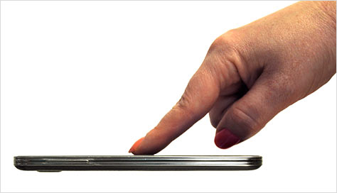
These days, a common misconception about smartphones and tablets—partly from advertising—is that they are flat slabs of glass, as shown in Figure 1. While phones are as thin as possible, and this is often the view that their manufacturers use in advertising them, everything happens on the screen of this thin, nearly flat phone. But even if phones were to become infinitely thin, people are three dimensional and exist outside the phone, as you can see in Figure 2.
People use their phone in real environments and interact with them just as they do with anything else, so we must set aside the assumption that they’re interacting just with a flat, glass screen. The way people hold and tap their phone changes according to their grip—and that changes frequently because they may be carrying items, holding onto children, talking to others, or opening doors.
Champion Advertisement
Continue Reading…
Figure 1—A thin, flat smartphone with a touchscreen Figure 2—Person interacting with a smartphone’s screen
Environment
People shift the way they hold and touch their devices depending on the device, the input that is necessary, the position on the screen that they are trying to tap, and their context. But what contexts? I have observed people changing the way they’re holding their phone when
opening a door
carrying groceries
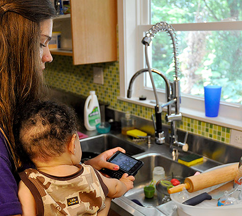
carrying a baby, as in Figure 3
walking down the street
walking in difficult terrain or stepping off a curb
riding on a train or bus, especially when standing
when in a dangerous context such as when walking in the wind or near water or a drop-off
Figure 3—A woman using a phone when holding a baby
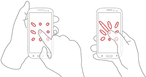
These changes are just to let people keep a hold of their phone with some confidence and enable them to manipulate it. People don’t generally stop using their devices—despite the inconvenience, regulations, or social conventions. People just adapt to their situation—but they do suffer consequences, including car crashes. Simply carrying a bag of groceries reduces accuracy in unexpected ways. Ng, Brewster, and Williamson have found that carrying a shopping bag can reduce touch accuracy in the most distant corner of the screen by over 30mm, as shown in Figure 4. Note that this applies to targets about which we’re arguing whether we should allow a 10mm interference size or can live with 9mm. People missing targets by a factor of six has not even occurred to us.
Figure 4—Accuracy of nine targets when holding the phone in two different ways and carrying a bag
Accuracy is better when people use a second hand, but it’s still worse than when people aren’t carrying anything. In my contextual observations, I’ve seen that people spend a lot of their time on mobile phones when doing normal things in their lives. But how can we account for users who might miss their touch target by an inch or two?
Accessibility
More often than not, companies consider design for accessibility a nice-to-have goal or an edge case. After all, how many disabled customers can your product possibly have? In actuality, there are currently one billion people who suffer from some sort of disability. That’s fifteen percent of the entire population of the world. And that percentage is growing as medical interventions extend people’s lifespans. In the West and other places where there is a long life expectancy, the average individual will spend over 11% of their entire life living with a disability.
Plus, all of us are periodically or, as Robin Christopherson says, temporarily disabled. By considering the accessible use case, you can ensure that a mobile device works for every user all the time. We use our devices in loud environments where we cannot hear, in glare or rain that prevents our seeing well, in circumstances where we cannot touch the device at all or at least not accurately—and we may be distracted. When people are distracted, they may miss subtle cues such as beeping or blinking.
For interactive systems especially, our definition of disability needs to be very broad. Colorblind people don’t raise their hands when we ask who has a disability. In general, people think of others as being disabled and themselves as just having a little problem with their whatever. Therefore, most disabled users don’t use their phone’s accessibility features. If you tell them the location of a feature like type size, they may be uncomfortable admitting that they need it.
It’s better to design fool-proof systems—ensuring simple things like comfortable type sizes and good value-contrast ratios on mobile devices—so everyone can use them better in their day-to-day lives. This also ensures that everyone can use them when they are temporarily disabled.
Ignoring accessibility may prevent your keeping your existing customers, as well as from reaching an $8-billion market.
Empathy
When I talk about the many ways in which people behave and the different limitations they experience, many designers and developers throw their hands up and say, “It’s too complicated. We should just design for the ideal or majority cases.” Why not assume that the 50% of all people who hold their phone with one hand are our baseline; and that they’re standing still, staring at the screen, have good or corrected vision, aren’t colorblind, and so on? Can’t all of those other users just muddle through, change their behaviors, or have a friend help them?
Of course, this viewpoint is antithetical to my favorite principle of user experience: empathy. We must not rant about device fragmentation or ignore people whose behaviors are different from our own. We shouldn’t blame users for being who they are or discount the importance of their unique goals and needs.
Instead, we must consider the goals, innate behaviors, preferences, abilities, and styles of all users as valid. We should design products that address all users’ needs and behaviors. We have to embrace the complexity and design to accommodate the messy lives that our many different types of users live.
I find that it is best always to assume that you’ve missed something about the way users live, work, or use their devices, so you’re prepared to deal with the unexpected.
Fingers
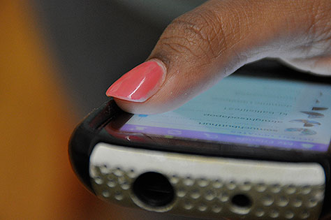
Phones are not flat. The creators of some operating systems, browsers, and apps like to assume that a phone’s whole screen is flat glass, and they can position items along the edge of the screen or create edge gestures—such as dragging from or to the edge of the screen—based on this assumption. Plenty of devices have a raised bezel to protect the screen, and the majority users put cases on their devices, as shown in Figure 5. Since cases are really the norm for smartphones, be aware that they may interfere with users’ touching the edge of the screen.
Figure 5—Cases on smartphones can interfere with touching the edge of the screen
What this means is that many people actually cannot touch the edge of their phone’s screen. If they press really hard with their finger, they might be able get skin onto the edge of the screen, but touchscreens sense the center of the contact area. So even if a person can push hard enough to make contact with the edge of the screen, the sensed point may be well inside the edge.
If you want to place objects right against the edges of the screen or use edge gestures, go right ahead. But don’t design them so they work only at a point that is one pixel from the edge or that originates off screen. Provide considerable padding around touch targets.
The safe zone for touch targets is somewhere between half the width and the full width of a touch target, but accuracy varies by zone. Along the sides, I use 6 to 8mm, but for the top and bottom, I extend this to 10 to 12mm.
Resilience
Resilience engineering is something that big, reliable services like Google, Facebook, Etsy, Flickr, Yahoo, and Amazon use to stay online. At a deep engineering level, they follow practices and procedures that ensure their systems are not brittle, avoid failure or fail gracefully, and are easy to fix.
Engineers usually define resilience as the ability of a system to absorb disruptions without tipping over into a new kind of order. For example, when an earthquake strikes and subjects a building to too much lateral ground movement, it settles into a state that is best described as a “pile of rubble on the ground”—unless its design is adequate to resist such disruptions.
We approach all design of technical systems from the engineering perspective, so assume that we can codify the process and predict failure points. But we can’t. Our systems are embedded in other technical systems. They may be embedded in very complex ecosystems. For example, the user may carry a device around, subject it to rain, experience traffic delays, or need to calm a screaming baby while carrying the groceries.
You need to make your designs resilient because users will never, ever do what you expect them to do. You or others in your organization probably draw diagrams that assume everyone starts at the home page of your site, then drills down through a preferred path to get the information they need, but this is not true. People bookmark, share, and search for your Web sites and resume using your apps from many different places. They follow their own process in unexpected ways. Your system returns errors or data that you didn’t expect.
If you were to try to design a system to accommodate all of these use cases or to test for them using a traditional use-case model, you literally could not do it. On one project that I worked on, I did some quick math during a meeting as we added more and more use cases to the work plan. I stopped everyone to demonstrate that creating use cases for all variants would take approximately the remaining life of the universe.
We work on arbitrarily complex products, so we have to embrace the complexity and design differently, to avoid error and fail gracefully.
Resilient Design
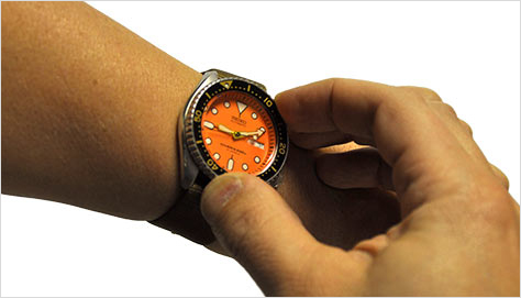
I love my Pebble smartwatch, but I still wear old-timey, mechanical-dial watches sometimes. One is the dive watch shown in Figure 6—just because it’s shiny, not because I’m a diver. It has a rotating bezel, or ring, around the outside. If you don’t know—and I didn’t till I actually owned one, then looked it up—you can use this as a simple timer. But on my watch and, in fact, all dive watches, the ring turns only one way because a detent limits its movement. On aviators’ watches, there is no detent.
Figure 6—One-way rotating bezel on a dive watch
Why is that? Because it’s for timing the remaining air in their tank. If the ring were to get bumped, changing its setting, having it show less time might be inconvenient, but its going the other way and showing that you have more time than you do might kill you. You don’t even need to know how it works. It just works. This is the sort of fool-proof, unobtrusive solution that I’m talking about when I refer to resilient design.
On a typical Web site, I find that the home page is rarely the entry point for more than 10% of visits—and the percentage is often so low that it is insignificant—just hundreds of visits a month of hundreds of thousands of visits to the site. This becomes even more important because of the way that people engage with mobile devices. Sometimes people seek out and consume content for just a few seconds at a time. They get interrupted, then come back to read a bit more, so the content has to be there for them. Does your information work well and make sense if someone sets it aside for a few minutes? A few hours? Make sure that the expirations of sessions and other technical events don’t obstruct users’ coming back.
You cannot tack on resilience, accessibility, or security later on. You must architect your systems for these capabilities from the ground up. From the moment you first begin putting Post-it notes on the wall, your intent must be to accommodate every user, in every context.
Designing touch interfaces to avoid all of the problem cases and even catastrophes that I’ve described in this column means understanding, at a basic level, what sorts of problems users may encounter. When designing touch interfaces, always do the following:
Prioritize controls hierarchically—not as you would for desktop computers or printed pages, top to bottom—but by putting the key controls in the middle of the screen and secondary functions at the top and bottom edges.
Put as much space between controls as you can.
Place controls with opposite results—such as Submit and Cancel—on opposite sides of the screen, with enough space between them to ensure that users can avoid accidentally hitting the wrong one.
Avoid unrecoverable conditions. Make items recoverable for at least a short time—for example, by providing undo to recover deleted items.
Protect users from inadvertently using controls that trigger unrecoverable conditions. Isolate these controls on the screen or use gestures, press-and-hold interactions, or Are you sure? message boxes to guard users from their untoward effects.
Don’t place controls that trigger trivial or even secondary actions near those that initiate unrecoverable actions. Email formatting controls, for example, should never be right next to the Send button.
Design to avoid annoying users. Even if it’s not a catastrophe if a user taps an item, displaying a progress bar that indicates a long loading process frustrates users. Either make the experience less annoying or make the control harder to tap by accident.
Conclusion
Don’t naively ask your client or product owner if designing for accessibility principles or any particular user type is in scope. Assume that they are. Sure, ask questions, do research, and find out what your key use cases are. But stop making assumptions that ideal cases are the norm and everything else is an edge case. People and their environments are different enough that all users and use cases are edge cases. Plus, they’re changing all the time.
Whether making tactical design decisions—for example, regarding edge gestures or icon placements—or more strategic design decisions—such as devising an architecture to prevent errors—we must always design for people and the myriad ways in which they work and live.
References
Alexander Ng, Stephen A. Brewster, and John H. Williamson. “Investigating the Effects of Encumbrance on One- and Two- Handed Interactions with Mobile Devices.” Proceedings of the 32nd Annual ACM Conference on Human Factors in Computing Systems, May 1, 2014. Retrieved December 15, 2014.
For his entire 15-year design career, Steven has been documenting design process. He started designing for mobile full time in 2007 when he joined Little Springs Design. Steven’s publications include Designing by Drawing: A Practical Guide to Creating Usable Interactive Design, the O’Reilly book Designing Mobile Interfaces, and an extensive Web site providing mobile design resources to support his book. Steven has led projects on security, account management, content distribution, and communications services for numerous products, in domains ranging from construction supplies to hospital record-keeping. His mobile work has included the design of browsers, ereaders, search, Near Field Communication (NFC), mobile banking, data communications, location services, and operating system overlays. Steven spent eight years with the US mobile operator Sprint and has also worked with AT&T, Qualcomm, Samsung, Skyfire, Bitstream, VivoTech, The Weather Channel, Bank Midwest, IGLTA, Lowe’s, and Hallmark Cards. He runs his own interactive design studio at 4ourth Mobile. Read More

