In a recent Mobile Matters column, “Tools for Mobile UX Design: Task Flows,” I covered how to draw task flows, why you should draw task flows, and the value of the level of system understanding that task flows give to your project team. However, I didn’t cover everything about the architectural decisions that go into creating task flows, so in this column, I’ll dig into some other things relating to task flows that I think are important.
Hopefully, you’ve spent some time thinking about how to organize the digital products or services that you design. What is the relationship between elements? When should they be next to each other, on top of each other, or stacked one above the other?
Champion Advertisement
Continue Reading…
The way you diagram the task flows for an app or Web site should always communicate something about the organization of the elements it contains, to ensure that users will be able to understand its structure and navigate to and between the information and the functions they need.
The Back Stack
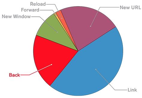
The first thing to consider is how much people love to tap Back. While most interactions occur within the body of a page or screen, users’ most common single action is going back from wherever they are. Figure 1 shows Web browser data that supports this fact, but I’ve observed similar behavior in mobile apps. In fact, tapping Back is as common as going to a new site, making it the most frequent interaction in browsers. Back is the one thing people rely on in a mobile user interface—whether on a Web site or in an app.
Figure 1—Chart showing classes of browser actions, including Back
When you start conceiving of an interaction, leverage the concept of the back stack. This is definitely something you need to deal with in app design and development, but interacting with Web browsers is much the same, so this design concept works well for browsers, too. A user builds the stack by clicking links or navigational items.
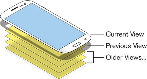
As you can see in Figure 2, for users, an app or site exists as a stack of views—or pages, if that helps—in which the page the user is currently viewing is the page at the top of the stack. The previous views, or pages, are waiting behind it. When the user goes back, it destroys the current view and displays the next view down in the stack.
Figure 2—The back stack, comprising pages a user has previously viewed
On the Web, this is usually called the history, but it is the same basic principle. The concept is slightly more interesting in apps, but since a user can return to those views, history really isn’t quite the right metaphor.
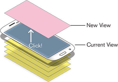
A user builds the stack by tapping items in an app, spawning new views. As shown in Figure 3, a new view gets added to the stack whenever the user taps something and a new page or screen loads.
Figure 3—Adding a new page to the back stack
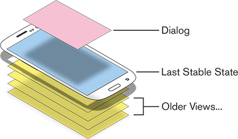
This concept is one reason dialog boxes work so well. Opening a dialog box loads an item into the stack, but one that is smaller than a full page, so the previous item in the stack is still partially visible. As Figure 4 shows, a dialog box is a view that is obviously on top of a page. All new views appear on top of other views, but the reduced size of the dialog box clearly indicates that the next one down is waiting for the user to return to it, and the dialog box is just a temporary view. Completing the task or closing the dialog box returns the user to the previous view.
Figure 4—Dialog box, with the previous item in the stack still visible beneath it
Note that you should not call dialog boxes modals unless they actually are modal. There are also modeless and semi-modal dialog boxes. Each of these has unique uses, so pick the one that’s appropriate for your situation. Be very explicit when communicating what type of dialog box you want to build, instead of assuming or implying that everything is a modal dialog box.
History and User Expectations
For the Web, be sure that your support of the Back button is robust. Do not build please-don’t-tap-Back dialog boxes. Ensure that your Web site supports the complete history, because Web browsers always make it available.
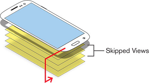
Apps do present options. For example, users can jump back several steps, as shown in Figure 5, destroying views in the stack at will. You can imagine where this might be useful—for example, in a checkout process where the user commits each step, and the process takes the user to the next step.
Figure 5—Jumping past views in an app’s back stack
But be very, very careful. Users expect the complete back stack to be available. If your site or app skips past some pages when users tap Back, users may become confused when they see something unexpected. When your app’s back stack behaves oddly, users may be surprised, disappointed, or even angry, if they have lost all of the information they provided during a checkout process or filled in on a form.
You could remove Back from apps or add confirmation message boxes that appear when a user taps Cancel—which might ask, “Are you sure you want to stop checking out?” But these are still unexpected—so much so that I have seen people hit the Back button or wonder why the corner of the screen is blank so they cannot go back.
Whenever possible, design your app to support a complete, simple stack that users can understand. And be sure to define the stack clearly for your developers, so they don’t dream up something else that isn’t what you intended.
Tabs and the Back Stack
Some mobile apps support another interaction that can confound the back stack: the tab view. But you can use this to your advantage to get around the limits.
A handset provides a small view into a huge realm of information. Sliding a page sideways so a user can see more information makes sense. This concept is built into Android and can be made to work easily enough in iOS.
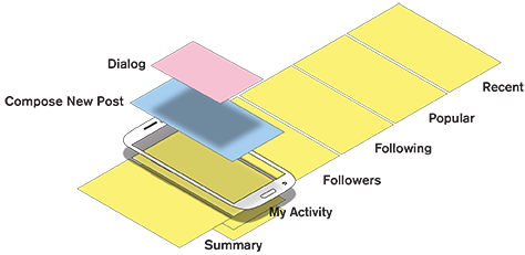
In any set of tab views, such as that shown in Figure 6, all views are logically at the same level in the stack relative to other views in an application. This example from an actual product shows how the tabs are all at the same level in the stack. Switching between these views is not a function that the Back button supports, so either there is no Back button or tapping back takes a user down one level in the stack—not to a previously viewed tab.
Figure 6—Tabs at the same level in the back stack
You could make tabs on your Web site work the same way, but it takes more effort. Using JavaScript and CSS—or better yet, Ajax—to load different content into tabs in the content area of a page works great, but requires additional code.
Think very hard about what you make tabs appear to do and what they actually do on a Web site. For example, the functionality of tabs that load new content on the same page may conflict with that of a first-level navigation bar that loads new pages. Consistency is important to avoid confusing your users.
Leaving a Site or App
When a user is already viewing the first page in your app, what does Back do then? Well, this brings up another thing that confuses many designers, developers, and especially, upsets many product owners.
When users are at the lowest level of the stack for your app or Web site, tapping Back again leaves your app or site, taking the into a higher level stack. This returns users to the home page of their phone, the Web site they previously visited, the app that sent them to your site, or wherever the stack dictates.
This is not a bug. It’s not even a bad thing. This is expected behavior, so let it happen and don’t let your boss panic about it. It’s rarely important that a user stay in your app or on your site in such a case.
As always, we have to support user behaviors and needs, not make them bend to our will. When people exit your app or site, they’re generally not making a mistake, but actually want to exit. People switch between apps and sites a lot. Their leaving may not even mean they’re rejecting your app or site; they are simply using your app in a way that you didn’t expect.
If your app or Web site refreshes, restarts, loses users’ information, or makes users sign back in if they return after being away for just a few seconds, this is bad. If your app or site doesn’t support switching well, you need to fix this. If you don’t, people will stop using your product. Don’t try to prevent people from leaving. They will go anyway and will just get mad about your trying to force them to stay.
Running Apps in the Background
You can make apps run in the background, and many should do just that. At least, apps should suspend, not exit when a user backs out of them.
Using mobile devices is about what users want to do more than about your app—about interruption and task switching. Mobile devices are personal and aware, so if every time users launch an app it asks who they are or waits for a while to decide what the world is up to, people will become annoyed.
If your app does something more dynamic—if it’s about ongoing status, controls a remote system such as a wearable device, or updates regularly with information from the Internet, the app should actually run in the background. This allows the app to push notifications to users. These notifications may be the primary user interface, or they may remind users to look at the app.
Web sites can also run in the background. What magic is this, you might ask? Well, none at all. It’s all about frames of reference. Your Web server runs all the time and can easily do stuff relating to a user when the user doesn’t currently have an active session and isn’t clicking. Don’t think of users who have signed out as being lost to you. Remember, you can still send them messages via email and SMS to give them information, update their status, or entice them to visit again.
Authentic Design
When clients or coworkers tell me they want a clean or modern design, I assume that just means they want a contemporary look of some sort. But this is a bit vague and open to interpretation.
There are plenty of design principles, but I sometimes like to go back to the Good Design movement from the 1950s. For a long time, I have lamented that we cannot really use them for digital designs. Let me pull just one of them out for you:
“Express the qualities and beauties of the materials used, never making the materials seem to be what they are not.”
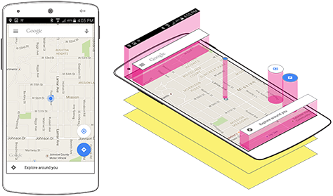
But this principle actually can be applied to digital designs. It seems to be talking about skeuomorphism versus flat design, doesn’t it? Sure, but the opposite of skeuomorphism is not flat, but authentic design. You’ve all seen Google’s Material Design, but look again at the example of a Material app shown in Figure 7. What is it really doing? The elements of Material Design express and emphasize the fundamental layering of the mobile app user interface.
Figure 7—Material Design expresses an app’s fundamental layering
Material Design is not flat; nor are its elements shadowed arbitrarily to emphasize their edges. Elements are actually layered above other elements—just like the layering of entire views in the back stack. People become familiar with the conventions of their mobile device very rapidly and form mental models of their interactions—just as though they are in a physical space. Consistently emphasizing the user’s current context is designing with people in mind—not just systems.
Understanding and using all of these techniques and principles of depth and layering is not a new, flash-in-the-pan design conceit, but core to making your designs make sense to your users.
References
Ambrozio, Gustavo. “Background Modes in iOS Tutorial.” Ray Wenderlich Tutorials for Developers and Games, May 2, 2013. Retrieved June 23, 2015.
For his entire 15-year design career, Steven has been documenting design process. He started designing for mobile full time in 2007 when he joined Little Springs Design. Steven’s publications include Designing by Drawing: A Practical Guide to Creating Usable Interactive Design, the O’Reilly book Designing Mobile Interfaces, and an extensive Web site providing mobile design resources to support his book. Steven has led projects on security, account management, content distribution, and communications services for numerous products, in domains ranging from construction supplies to hospital record-keeping. His mobile work has included the design of browsers, ereaders, search, Near Field Communication (NFC), mobile banking, data communications, location services, and operating system overlays. Steven spent eight years with the US mobile operator Sprint and has also worked with AT&T, Qualcomm, Samsung, Skyfire, Bitstream, VivoTech, The Weather Channel, Bank Midwest, IGLTA, Lowe’s, and Hallmark Cards. He runs his own interactive design studio at 4ourth Mobile. Read More
