Digital products are about content. Even if you think they’re all about interactivity, controls are pointless if users don’t understand their purpose and cannot read about what they do. The most important thing you can do to make a Web site or app usable is to make sure everyone can read its text, on every device, under every condition.
Units and Conversions
First, let’s define some terminology. People often use the term font incorrectly these days. Technically, in the modern world, a font is a digital file containing a particular typeface. In this column, I’ll be using the term type when referring to the characters that make up printed or displayed text—including the content, the font or typeface, and its size and color.
Champion Advertisement
Continue Reading…
The other thing we have to get straight is that, when talking about reading text, we’re talking about human behavior, on many different devices and platforms. Many usability standards and accessibility guidelines assume that all digital content is on the Web and that pixels are the standard unit of measure.
But people live in the real world, where things aren’t measured in pixels, so we have to use physical units. For many centuries, the standard unit of measurement for type has been the point. This, of course, is not the iOS device-independent pixel for which Apple inexplicably stole the name point, but a typographer’s point, which Adobe has rounded slightly to 1/72nd of an inch for the PostScript standard. So you can also call this a PostScript point.
Because of variations in device scaling, there is no perfect translation between units of measure for different devices and platforms, but I use the conversion values shown in Table 1 in my design documentation.
Table 1—Conversion values
To convert from points to…
Multiply by
Web pixels
1.34
Web ems
0.8
Android SPs or DPs
2.0
iOS points
2.25
I create all of my designs at full scale, defining type sizes—as well as icon sizes and margins—in points, then translate the sizes for the developers so there is no ambiguity.
People Use Different Devices in Different Ways
Stop saying “fragmentation” as though it is a bad thing. Respect user choice. People buy and use a variety of devices because their needs differ. The way they use devices differs, too.
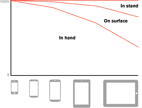
From my many, many observations of users in the field, I know the distances at which people hold different device types when reading on them or tapping them. As shown in Figure 1, this varies by devices’ screen size.
Figure 1—How and whether people hold different device types
The larger devices get, the further away from their eyes people use them. People hold small handsets very close to their eyes, larger handsets and phablets further away, and tablets at approximately desktop distance because people often place them in stands and use them with keyboards.
I agree entirely that not everyone works in the same way. I have lots of anecdotes about how specific users, in specific situations, work with their devices differently. Ideally, all of us should get out in the field and find out how our users actually work.
But I also recognize that most designers don’t get to do that, so way too much of the time, they fall back on quick, cheap, responsive templates and just want some guidelines on type size to make them basically usable. These provide very basic guidance that you can follow when you have to guess or assume what type size to use based only on device class or screen size.
Minimum Type Sizes
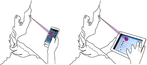
Whether you’ve observed users directly or surmised the appropriate type size to use according to device class, understanding distance is critical to designing a readable user interface. That’s because it’s not the size of an object on a screen that’s important, but its resolution based on the screen’s distance from our eyeballs. The relationship between size and distance is called angular resolution, and you can calculate it using this formula:
Visual Angle (minutes of arc) = (3438) * (length of the object perpendicular to the line of sight) / (distance from the front of the eye to the object)
This is actually the simple version of this formula. Getting the number 3438 requires knowing the average wavelength of visible light and the size of the sensors in our eyes. Thus, to get the same readable type size, it has to be larger when a display is further away, as shown in Figure 2.
Figure 2—Angular resolution
This is why you can watch a TV show on your phone or iPad as comfortably as you can on your TV. Because portable devices are closer, you have about the same field of view. We can calculate type size for different device classes based on our understanding of what people can see and understand. In Table 2, I have done the math for you for a few device classes, based on the typical distances at which people hold them.
Table 2—Minimum type sizes for device classes
Device class
Minimum type size in points
Small phone
4
Large phone
6
Phablet
7
Small tablet
8
Large tablet / desktop
10
Minimum type sizes range from 4 points for small handsets to 10 points for any devices on tables or in stands, which people use at arm’s reach.
Note that these are minimum sizes. It is critical to understand this. You will need larger type for almost all circumstances. However, I do find the minimum sizes to be useful for things like labels under icons. They should be just one or two words and serve as a backup for the icon, which you can peer at over your glasses for a moment with no undue hardship. Icons and other readable elements follow the same scale rules and, roughly, the same sizes. The same concerns regarding readability apply as for text.
Contrast
The other absolutely key thing to making sure that text is readable is suitable contrast. Contrast is the critical measure rather than color, not just because of the many people with color-vision deficits, but because of glare. Glare on mobile screens is almost constant and can easily distort or completely wash out colors.
As accessibility has progressed from a good idea to a key market differentiator, to a standard that is required by law, it has become especially important that we design all of our content to have the best possible contrast ratio.
The W3Cs WCAG provides the best recommendations—although they are, as is typical, tied too much to Web pixel sizes. However, I prefer to use the enhanced AAA standards because difficult environmental conditions are so prevalent for mobile device use that having the best possible contrast ratio is important. These ratios are
7:1 for normal text
4.5:1 for large text
Whenever possible, I use black and white for key content. This gives a contrast ratio of 23:1, so you can see that 7:1 isn’t a terribly stringent requirement if you put some thought into ensuring proper contrast early in the design process.
On mobile devices, I usually prefer to use white text on a black background for two key reasons. Primarily, I do this because white on black reduces the total amount of light reaching the user’s eyes, so high screen brightness works well in the dark, as well as in full daylight. Plus, the way many mobile-device screens work, this reduces power consumption because only lit pixels consume power.
This doesn’t mean you cannot use color and do things like run type over images. Just design such text carefully. One common solution is to restrict this sort of background to large titles, subtitles, and headings, and make sure longer blocks of text, lists, tables, and forms are on simple, high-contrast backgrounds.
Readable Sizes
So far, I’ve discussed only minimum visible type sizes. But most content needs to be larger than the minimum sizes so users can more easily consume it—whether they’re glancing at it on the go on portable devices or because they have vision or cognitive problems.
There has been enough very good research using eyetracking, with participants who have trouble reading, that we have a good handle on what type sizes are necessary. My research with actual products bears these findings out quite well. Table 3 shows optimal type sizes for reading different types of content on various devices classes.
Table 3—Type sizes for reading, in points
Device class
Minimum
Basic content
Enhanced content
Small phone
4
5.5
7.2
Large phone
6
8.5
10.8
Phablet
7
9.8
12.6
Small tablet
8
11.2
14.4
Large tablet / desktop
10
14
18
Regardless of device class, make basic content at least 40% larger than the recommendations for minimum sizes. However, if you expect the environment or user needs to make larger text necessary, you can go up to 80% larger for enhanced content. Larger than this, readability begins dropping again, so don’t go much over the enhanced size.
Base your decisions about what size type to use on your expectations regarding where people will use your device and the needs of your audience. Older users with poor eyes like me and prevalent usage of devices on buses and when walking down the street necessitate larger type sizes. More use outside means more glare, so you need larger type sizes, better contrast ratios, or both.
Define Hierarchies with Size
In Table 3, content refers to anything people must be able to read easily—from a button label to a paragraph of text in an article. First, think about how large readable items must be, then decide what other text you can differentiate using type size.
Size is one of the best ways to help emphasize the hierarchy of information on a screen. For example, important functions, important data, or an introductory sales paragraph could be at the enhanced size, while the rest of the content is just at the normal size, and icon labels are at the minimum size.
What if you want to use size to differentiate other type such as section headings? You would need even larger type. How much bigger? Well, how about we just follow best practice. Standards and surveys coalesce around a set of common sizes pretty well. In this case, I’ve used the HTML standard size differences as a baseline, as shown in Table 4. Of course, you may also want to make titles or headings bold or otherwise differentiate them from body copy to make sure the hierarchy is clear.
Table 4—Type sizes for content and headings, in points
Device class
Minimum
Basic content
Enhanced content
H3
H2
H1
Small phone
4
5.5
7.2
8.5
10.8
14.4
Large phone
6
8.5
10.8
12.6
16.2
21.6
Phablet
7
9.8
12.6
14.7
18.9
25.2
Small tablet
8
11.2
14.4
16.8
21.6
28.8
Large tablet / desktop
10
14
18
21
27
36
While I have used HTML tags (H1, H2, H3) to indicate the hierarchy of headings in Table 4, this is just because they are very convenient labels. The same principle holds true for any platform. Plus, you can use these sizes for other key information such as labels on a dashboard.
Note that I’ve listed only three levels of hierarchy. My experience in putting complex data in front of people is that more than three levels of headings become difficult to understand, regardless of how you differentiate them. If you need fewer levels, you can get away with cutting off sizes at either end of the range. Only have page titles? Then you can make the titles the H2 or H3 size pretty safely if you need them to take up less space.
Try to prevent headings from wrapping. Work with your actual content and the smallest likely device, then choose the size that works best. If short headings abound, you may be able to get away with an even larger type size.
However, I have seen some evidence, from my own and others’ research, that excessively large sizes of type, icons, and form controls can become unreadable or unrecognizable. My favorite example is a button whose size was so inflated that users thought it was a banner ad. Staring right at the big, red button, they could not find it and submit the form because it didn’t look like what they expected anymore.
People Touch Only What They See
No matter how interactive a digital product is, if people cannot read and understand its text, they cannot use it.
Good use of typography starts with basic legibility, which depends on choosing the right types sizes and using good contrast. Whether you are designing apps or Web sites, make sure your basic design principles include appropriate type sizes, a good sense of hierarchy, and some way to ensure readable contrast.
References
Bernard, Michael, Chia Hui Liao, and Melissa Mills. “The Effects of Font Type and Size on the Legibility and Reading Time of Online Text by Older Adults.” New York: CHI ’01 Extended Abstracts on Human Factors in Computing Systems, CHI EA, 2001.
Beymer, David, Daniel Russell, and Peter Orton. “An Eye Tracking Study of How Font Size, Font Type, and Pictures Influence Online Reading.” Swinton, UK: Proceedings of the 22nd British HCI Group Annual Conference on People and Computers: Culture, Creativity, Interaction, Volume 2 (BCS-HCI ’08), British Computer Society, 2008.
Hoober, Steven, and Eric Berkman. “Introduction to Mobile Typography.” Designing Mobile Interfaces. Sebastopol, CA: O’Reilly, 2012. Retrieved August 17, 2015.
Hoober, Steven, and Eric Berkman. “Human Factors & Physiology.” Designing Mobile Interfaces. Sebastopol, CA: O’Reilly, 2012. Retrieved August 17, 2015.
Rello, Luz, Martin Pielot, Mari-Carmen Marcos, and Roberto Carlini. “Size Matters (Spacing Not): 18 Points for a Dyslexic-Friendly Wikipedia.” New York: Proceedings of the 10th International Cross-Disciplinary Conference on Web Accessibility (W4A ’13), ACM, 2013.
I really enjoyed this article! I’m struggling with the conversion from points to pixels via Photoshop to the browser. I realize that every browser is different, but when I do the conversion you’ve suggested, they seem way off. Am I doing something wrong?
I notice that the conversion factor from points to ems is wrong. It should be closer to 0.1. (Perhaps you meant 0.08.) But, of course, it depends on the base font size, so it’s only a rule of thumb anyway.
First, I thought I had answered these questions, so sorry if I missed one.
Chris: Happy to talk through it more, but one key issue is often getting the resolution correct. Make sure you are not using 72 dpi, but the resolution of your actual device. I’ve gathered up some tips for designing in Photoshop—and the sizes that I need for all platforms—on my Raster Design Tips page. Hope it helps.
Bennett: This ratio seems right for us, but of course, it depends on the base font size. If I assume 16px, it seems to be 0.75 by the straight math, but experimentally, 0.8 is a bit closer—plus it’s less typing.
And lastly, I am seeing some odd behavior on iPads lately. In the past, the scale ratio worked fine, but experimentally, on an app we’re working on now, it’s not the same. Instead, 1.67 seems to be closer to the right ratio.
Has anyone else got a solid physical point to Apple-point scaling ratio they can share from their work? Or do you know that some dev environments cause scale ratios to behave differently?
For his entire 15-year design career, Steven has been documenting design process. He started designing for mobile full time in 2007 when he joined Little Springs Design. Steven’s publications include Designing by Drawing: A Practical Guide to Creating Usable Interactive Design, the O’Reilly book Designing Mobile Interfaces, and an extensive Web site providing mobile design resources to support his book. Steven has led projects on security, account management, content distribution, and communications services for numerous products, in domains ranging from construction supplies to hospital record-keeping. His mobile work has included the design of browsers, ereaders, search, Near Field Communication (NFC), mobile banking, data communications, location services, and operating system overlays. Steven spent eight years with the US mobile operator Sprint and has also worked with AT&T, Qualcomm, Samsung, Skyfire, Bitstream, VivoTech, The Weather Channel, Bank Midwest, IGLTA, Lowe’s, and Hallmark Cards. He runs his own interactive design studio at 4ourth Mobile. Read More
