In this column, instead of talking about one of my usual topics—tactics to avoid errors—I’ll discuss how to work within constraints and pragmatically address real-world issues. During the software-development process, your team may ask you to design an error message. Annoying edge cases all too often pop up—usually too late in the process to fix the issue in any other way.
For starters, I never write what I’d call error messages. Admittedly, I occasionally use that term—in the same way I might use words such as sitemap—just at the beginning of a conversation to orient everyone to my process. Just as I did in the title of this column. But I then switch to a more meaningful term and get everyone to talk about exception messages.
Champion Advertisement
Continue Reading…
Error messages appear when a mobile app or Web application has been designed to be used in only one way and the user strays from the happy path. The user gets punished by having to deal with error messages.
I believe in resilient design, in which we must allow users to solve problems and explore information in whatever ways they want. Still, when systems may respond in unexpected or exceptional ways, we need to make users aware of those exceptions and enable them to solve the problems they encounter. That’s where exception messages come in.
Interstitial, Inline, or Message Box?
Exception messages should be distinctly different from the primary content or functionality on a page. I generally use solid-color backgrounds to box the entire message, but a sufficiently thick rule can also work well for certain designs.
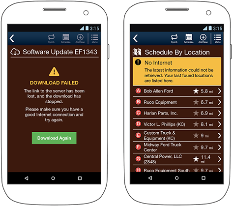
There are two basic types of messages: interstitial, or full-page, messages, and inline, or banner, messages. You can compare these two types of messages in Figure 1.
Figure 1—Examples of interstitial and inline-banner exception messages
Whenever possible, present messages within the context of a page, enabling users to interact with other page content or functionality—within the expressed limits—and correct the condition. Such messages typically appear as a banner at the top of the page, which scrolls away, so all other controls and content on the page appear and work as usual—with the exception of the problem itself, whatever it is. Think about when the condition may manifest itself, and don’t anchor the message to the top of the page if the user won’t be able to see it.
When a condition is not recoverable or requires the user to take some specific action, display an interstitial. In this case, the message takes up more or less the whole page, although the page title is often retained to preserve context. Disable or remove other items such as navigational elements so the user cannot escape without dealing with the issue. In mobile apps especially, retain the ability for the user to go back only if the user can simply cancel the process. However, this is by no means always possible or safe. I prefer to center the message text—even though this is something we would never otherwise do for readability—just because this difference makes the message really stand out.
Popups, or message boxes, should almost never be used. In fact, I cannot think of any reason for using a message box to communicate an exception condition. Message boxes have various issues, including the following:
We have limited ability to format them, so things such as severity, key information, and priority of action either degrade or are impossible to make apparent at all.
The overuse of message boxes means users immediately become disappointed or frustrated when one appears.
Users tend to dismiss message boxes without reading the content, so may make mistakes if critical functions appear only within a message box.
The Three Parts of an Exception Message
Exception messages are a classic example of the fact that UX design must actually solve problems, which UI design cannot. There’s no way to dress up an exception message such as “An unknown error occurred” sufficiently by using good color and type to make it helpful rather than frustrating.
The three steps of communicating an exception message are, in priority order, as follows:
What happened?
What does that mean?
What can the user do about it?
The first question is the hardest for engineering teams to answer. All too often, when I encounter a request for an exception message and ask these three questions, I have to ask them several times. The first response is typically: “We don’t know what went wrong.” You have to understand a little about response codes to know exactly what happened, then translate this information to user language.
Explain the consequences of the problem. Ideally, the engineers designed your system so nothing awful has happened. For example, the system automatically saved the data the user entered for later recovery. But explicitly communicate that because, once you display an exception message, your users will have little confidence in you. If something bad happened, be very clear about exactly what happened. If you aren’t sure, be as clear as you can be. “We may have lost your data” is vague, but it does try to address the issue and is way better than “An unknown error occurred.”
Do not assume users understand your system or are confident about taking unusual actions using it. Just this week, I had an Amazon customer-care representative start by asking me whether I had re-installed the app. Turning an app off, then on again or re-installing it are always annoying ways of troubleshooting or trying to fix a problem, but even more so when you must call customer care to have them tell you that. Help users immediately by including the actions they must take directly in the exception message.
Don’t Blame the User
Exception messages are, after all, exceptional, so you must explain them much more verbosely than most things in a user interface. How you write an exception message is as important as what you write.
Make sure you write exception messages as full sentences, following reasonable rules of grammar. If you aren’t sure whether an exception message is well written and you cannot afford actual writers, simply have someone else read it aloud. If it is hard to read or makes no sense when it’s read out loud, you’ve messed it up.
Be friendly and truthful, and never blame or insult the user. Avoid blaming the user even tangentially or by implication. For example, there’s no such thing as an invalid last name. The user may have typed his name properly so you might be accusing him not just of typing his name incorrectly, but of having a name that is invalid. Don’t do that.
Make sure anyone can read your messages. Your mobile app or Web application probably doesn’t have full language support—or even if it does, the users might not bother changing languages—so make sure complex messages don’t use idioms, colloquialisms, vernacular, slang, or jokes.
Don’t assume your users have a certain level of technical knowledge and will be able to get through your jargon. Even if you’re building a very complex system that clearly requires very specific, technical messages, make sure they’re really necessary. Your users are not you, so things you may think are obvious may not be obvious to them.
No matter how technical and jargon-laden your messages may be, never forget the basic three elements of good error messages. Tell the user what happened, what it means, and how to fix it.
Communicating Using Visual Styles
In addition to using words, we should reinforce messages using iconography, or symbols. I like to think of symbols as words, so they should be as unambiguous as any other words and blend in with the rest of the content. Create a distinct visual style for each type of exception message and document these styles in your style guide.
When reviewing messages for content clarity, assume the user will read symbols as words. So use the right symbol for each message. Sometimes you’ll need to use specific symbols, but always make sure there are just a few tiers or types of messages, each one of them differentiated by color and iconography, as shown in Figure 2.
Figure 2—Some example symbols and their associated colors
Associate each message type with a color, but don’t rely on color alone—not just because of users with color-deficient vision, but because glare and dirt on mobile screens can cause color shifting or effectively make them appear to be in grayscale. However, you should use color as a secondary method of signaling meaning.
Not Every Message Is an Error
Note that, in Figure 2, there are also messaging colors and symbols for informational and even success messages.
Sometimes we need to be explicit when conditions change in ways outside normal application behavior. So it is usually best to preserve consistent messaging style—even for success messages.
It can also be helpful to recall content principles. Of course, you should use a non-warning symbol and color, but also offer an explanation. I have seen users become confused when a success message appears, asking: “Now what can I do?” If you tell users what happened, what it means, and what they can do now, there will be no questions.
Remember, these are exception messages, not error messages. Any exceptional condition, or exceptional messaging, can share these same styles.
Supporting the Organization
Sometimes the simplification of messages to make them more user friendly causes issues in other areas. For example, reducing jargon and collapsing many subtly different messages into one user-facing message means it can be hard to debug or troubleshoot issues.
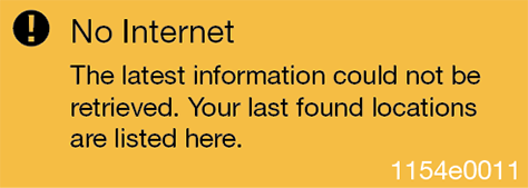
This is where error codes in messages come from. We have all used systems with messages that have little chunks of gibberish off in a corner—similar to the one shown in Figure 3—even though you may not have noticed it. I deliberately make these message codes less readable to avoid users’ wondering what they are—unless a support representative asks about them.
Figure 3—Message with an error code in the lower-right corner
Ideally, these are actually response codes or something else that is specific to the technical system. However, in my experience, information about such codes is spotty or comes late. Confusing conflicts may occur when these codes are ambiguous.
So, for a long time, I have simply come up with my own message codes. Document the exception messages in a table, chart, or spreadsheet instead of by creating a screen drawing of each one. All messages of a given type are in the same format, so just encode what style to use—both symbol and color—then include the text. Add a column for the message codes.
Making More Human Exception Messages
Don’t blame users by declaring their names invalid or telling them they need to fix their errors. Don’t be vague, saying some “unexpected error occurred.” Don’t use your organization’s technical jargon and talk about servers, runtime errors, or reset keys.
Do not rely on your users to fix system issues or blame them for such problems. However, when unexpected or unusual conditions occur, you must inform users so they are aware of what’s happening and can react appropriately.
Do not ignore user-centered design at the edges. Whenever the unexpected happens to users—whether good or bad—people become unsure of what to do and may become frustrated. They need clarity and help, as quickly as possible.
Hey Steven, thanks for writing this article up about exception messages. I noticed you used the word interstitial to describe a full-page message. I guess I haven’t heard that term used in this way before—not that I don’t believe it’s an appropriate usage. Just googling the word though reveals that it’s better defined as something that is living in the spaces between. Just interesting. That’s all. Thanks.
For his entire 15-year design career, Steven has been documenting design process. He started designing for mobile full time in 2007 when he joined Little Springs Design. Steven’s publications include Designing by Drawing: A Practical Guide to Creating Usable Interactive Design, the O’Reilly book Designing Mobile Interfaces, and an extensive Web site providing mobile design resources to support his book. Steven has led projects on security, account management, content distribution, and communications services for numerous products, in domains ranging from construction supplies to hospital record-keeping. His mobile work has included the design of browsers, ereaders, search, Near Field Communication (NFC), mobile banking, data communications, location services, and operating system overlays. Steven spent eight years with the US mobile operator Sprint and has also worked with AT&T, Qualcomm, Samsung, Skyfire, Bitstream, VivoTech, The Weather Channel, Bank Midwest, IGLTA, Lowe’s, and Hallmark Cards. He runs his own interactive design studio at 4ourth Mobile. Read More