I often think about the principles that drive design. Not just when musing in my spare time or because another column for UXmatters is due, but in my day-to-day work as I make decisions about how to design a product or solve a problem or discuss how to make a teammate’s design better.
Although I have done so in the past, I don’t really have to make up my own design principles. The things that drive optimal design for human beings have not really changed. Plus, it doesn’t take much abstraction of design principles for fields such as industrial design from the 1950s or ’60s to make them perfectly applicable to today’s digital product design.
Champion Advertisement
Continue Reading…
Some principles from Edgar Kaufmann Jr.’s 1950 book What Is Modern Design? resonate with me today. In his book, Kaufmann provided twelve precepts from his Good Design program at the Museum of Modern Art (MoMA):
1. “Fulfill the practical needs of modern life.” …
6. “Express the purpose of an object, never making it seem to be what it is not.”
7. “Express the qualities and beauties of the materials used, never making the materials seem to be what they are not.” …
9. “Modern design should blend the expression of utility, materials and process into a visually satisfactory whole.”
10. “Be simple—its structure evident in its appearance, avoiding extraneous enrichment.”
11. “Master the machine for the service of [people].”
12. “Serve as wide a public as possible, considering modest needs and limited costs no less challenging than the requirements of pomp and luxury.”
Some of Kaufmann’s precepts get into ethics as well. Chuck Harrison shared some similar thoughts in his Philosophy of Design and Life:
“Appearance should evolve or come about naturally as a result of function.”
“The honest designer must be conscious of not introducing fake or insincere elements…that may add visual interest but have no connection to function.”
Kaufmann and Harrison both discuss honesty and authenticity—representing the needs of the user and the functionality of the product honestly, without artifice or adornment. This means designing and developing products organically and embracing what makes them unique.
Finding Your Brand
However, too many decisions about product design today boil down to gut instinct or following trends—the herd.
Here’s an example: Why did all the Android OEMs (Original Equipment Manufacturers) start adding backgrounds to their icons and, subsequently, Google make this an Android standard a few years later? Design trends. Copying Apple, it seems.
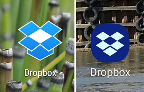
Why, though? Android has 85% of the global installed base. Solid data exists that shows unbounded icons are more visible, easily identifiable, and better in every measurable way. Transparent, uniquely shaped icons even used to be on lists of things that made Android different and good. Is the branding of a company such as Dropbox improved by having their distinctive iconography reduced to another blue blob, as shown in Figure 1.
Figure 1—Android icons for the Dropbox app, unbound and bound
What Would Apple Do? (WWAD?)—or Amazon, as some prefer—is always the wrong question to ask—unless you work for Apple or Amazon. Your organization is unique.
Slavishly following trends never comes from a sense of respect or a belief that a leading company knows better or is more creative than your employees. It comes from a sense of fear. Many organizations I’ve worked for actually fear their competition—so much so that they won’t even utter the names of their competitors out of some Dark-Ages concern that it would give them power.
Fear drives so much strategy. I know of awesome, industry-changing ideas that never got out of the war room because of fear that competitors would steal them. Don’t worry about the competition—or Apple or Amazon! Don’t consider the choices they made as a guide for your business. And don’t worry about their copying you either.
Instead, you need to think what you should do for your company. Your products, your structure and organization, and your customers are all different. Even among competitors in the same market segment, your company is unique. Your goal should be to understand your organization and its customers, then let solutions emerge naturally from that understanding.
Be true to your brand, your organization, your product, and your users. Pay attention to the data and solutions will emerge organically.
Finding the Truth
The UX designer exists to find the truth. Not to make things pretty or shiny or fast. As a UX designer, you make sure your designs work for your organization’s goals and methods and meet the needs and expectations of your users.
Marketing is about telling your users why your product meets their every need. User Experience is about creating products that meet users’ needs and expectations. How do we achieve that goal?
Conventional wisdom is just rumor and innuendo. Never work off your gut instinct or what someone once heard. One good example of such conventional wisdom is the F Pattern. You’ve probably heard of this. It’s supposedly the way people scan Web pages—meaning you should design your pages to support that.
But this belief is essentially untrue. The F Pattern is just one way people scan Web pages. There are several others, depending a page’s design. While the F Pattern is one way of understanding what people sometimes do, supporting it should not be a goal for all your page designs. But people have somehow latched onto this pattern as a design principle—and the marketing-tips-and-tricks types have misunderstood its use, so its overuse has become rampant. Worse, it’s not even a real way people scan or read on mobile devices, so designing for the F Pattern for phones or tablets is a sure-fire way to do it wrong.
Confirm that what you know to be true is true, and get the data on your market segment, your product, and your users. Don’t be fooled by bad data or bad methods.
Bad Methods
There are many bad ways of trying to gather information about how customers use or want to use your products. While these methods may not be inefficient or hard to apply, they are so generally bad that we should consider them evil. You can safely avoid the following methods altogether:
surveys—Surveys are so bad, so often that I never, ever suggest that anyone even do them anymore. Sure, they can sometimes work, but in limited ways. They are so prone to bias—in a dozen different ways! However, if you must run a survey, take it seriously. Hire researchers who conduct them for a living, then let them do their thing—and don’t overrule them.
focus groups—Focus groups are bias-engines, making it hard to get any good results no matter how hard you try. Group dynamics are hard to control, so getting good results depends entirely on how skilled your moderator is. That makes doing a focus group risky. For data gathering, an individual’s skill should never take the place of good methods and structure. I have even encountered moderators without morals, who asked what results I wanted to find! Do you distrust focus groups?
reviews and ratings—Your app-store reviews or star ratings might seem helpful and easy to understand, but these have many of the same issues as surveys. Bias often overwhelms the results. Only very good and very bad results generally appear in comments, with no explanations of the middling scores. Also, often what people type is neither accurate, complete, nor truly indicative of what they want or need.
feedback forums and expert panels—One way many organizations try to involve users is to host feedback forums. But these typically take place at executive gatherings or conferences, so you don’t generally hear about the actual issues and needs of the everyday user. Most do not include hands-on demos, but simple PowerPoint presentations about the product, listing out its benefits. If you ask, “Do you prefer our new design?” everyone will answer yes, every time.
fact-finding missions and tours—A great way of making your organization user centric is to have everyone go into the field and meet users. However, in practice, when leadership goes out instead of entire product teams, the benefits of field research often get diluted. Leaders rarely write down their findings—inducing recall bias—and meet primarily with other executives and managers, who always put their best face forward.
Net Promoter Scores (NPS)—NPS is based on bad science, so is simply a codified version of all the other bad survey methods. The findings from this research are demonstrably not repeatable, so of no value. Taking NPS seriously has led to many products getting worse.
I have recently seen several different executive teams return from feedback forums and site tours on the same product, then sit in a room and argue about their entirely contradictory findings. Non-repeatable findings are a hallmark of bad methods of research and cause us to make bad design decisions.
I often like to recall Richard Feynman’s lessons. Regarding design and data, one key quotation from him is as follows:
“The first principle is that you must not fool yourself—and you are the easiest person to fool.”
Don’t let yourself get tricked by bad data. Luckily you can simply avoid using the bad methods I’ve outlined here because there are many good methods that give repeatable results, good information, and often great insights.
Good Methods
Now, let’s look at some of the many very good methods that do deliver repeatable results, give you good information, and often provide great insights. Using these good methods reduces error, rework, and guesswork. Plus, they save you a lot of money and embarrassment later on.
heuristic evaluations—Very rarely is a product entirely new. Most products replace or improve on something that already exists or compete with another product in the same space. So start with an expert review, using your knowledge of proven best practices—or heuristics—to understand and rate the quality of a product or practice. Then come up with fixes or new ideas you can use.
workshops—Once your design team has a basic understanding of a product domain, you should trust the collective information your team possesses. As a team, using structured methods, you can find interesting information, realize unexpected truths, and expose clear gaps in your knowledge, then do more research. Simply get everyone in a room together, for a couple of half days, and run a series of exercises, recording the results at each step.
analytics—For existing digital products, simply looking at how people are using the current product can be very helpful. But take a hard look, and use all your analytical skills. Don’t just assume the top-line summary is right. Instead, check out why all bad behaviors such as abandoned sessions exist. Confirm that the data is accurate. I have seen analytics that accidentally filtered out huge numbers of users, providing very skewed information until we fixed the problem.
ethnography—Formally, this is the study of cultures. In product design, we can see how people do their jobs or use products in their day-to-day lives. Observe users with as little intrusion as possible. Pay the greatest attention to how they exist in their environment and what they do that a Web site, digital tool, or mobile app does not support.
card sorts and co-design—Often you can work directly with representative users to gather insights and develop conceptual designs. In contrast, card sorts engage actual users in organizing and naming complex structures such as categories for your products. Co-design, or participatory design, engages actual users in conceptual product design and page layout.
usability evaluations—During usability-test sessions, participants use a prototype or product. A moderator asks them to perform specific tasks, while talking about what they are expecting and experiencing, but your main focus is on observing their actual use. Instead of just getting their feedback or feelings, you can actually see whether they click where you expect them to and even measure how quickly they discover or use certain features.
System Usability Scale (SUS)—SUS is a very carefully constructed survey that has been around for decades. You can give this survey to users immediately after a usability test or other direct experience with a product, to assess their level of satisfaction with the product. The result is a single number that says how well the product is working.
You should use many of these methods on an ongoing basis—both to continue gathering information for future releases and to monitor a product’s performance over time. Even if you think a quarterly survey or NPS is giving you the data you need, try using these better techniques instead. A regular program that combines usability testing and SUS is especially helpful and works for many companies that put out successful, high-quality products.
From Discovery to Architecture
Gathering and discovering information, through a variety of tools and tasks, results in an organic collection of features, functions, goals, needs, and more.
Rather than simply synthesizing the information you’ve gathered from workshops, usability tests, and card sorts to inform your design, you can directly apply the resulting information in creating a high-level product design. Turn your notes, lists, and other research results into an information architecture (IA) for your product.
You should start at this structural level—a high-level, 10,000-foot overview of the entire product—because you cannot solve the biggest issues at the page level. Use everything you’ve learned during discovery to ensure the product works well as a whole. A product’s IA must neither be arbitrary, nor structured in the way that’s easiest to code, nor reflect the way your company is organized. It must be what users expect it to be—that is, match their mental model.
It is important to understand your users—they’re not like you. Remember to respect the UX research and the user input to the design process, being careful not to override the findings with good ideas—“I bet what they meant was…”—or gut feelings or fall back on legacy behaviors.
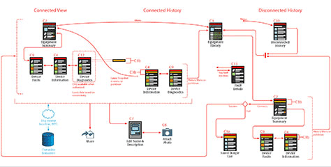
At this stage in the design process, you’ll make some sort of diagram that encompasses the work process and the structure of the product. I like to create a task flow similar to that shown in Figure 2, but many other types of diagrams can work as well—for example, a journey map. Since there are many diagram styles, it can be helpful to create more than one diagram of a single system, depicting the same thing in different ways.
Figure 2—A simple task-flow diagram
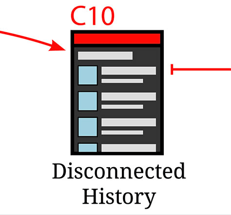
Keep in mind that this diagram defines only the process, structure, and flow. Beyond that, do as little drawing as possible at this stage—no page designs yet. While the end result of designing an IA is always a diagram—or series of diagrams—individual views can be either bulleted lists of content or simplified representations of different types of content, as shown in Figure 3.
Figure 3—A single view within the task-flow diagram
This cartoonish page diagram represents what sorts of content reside on a page—for example, text, forms, and selection lists—and other documents list the expected content or functionality. Often, this approach works well because you can maintain those lists as text documents or spreadsheets rather than committing to any sort of graphic design at this point. Separating the what from the how leaves room for exploring better solutions later on, even at the design stage.
This type of diagram feeds nicely into the template stage, which I’ll describe later, because you’ve started defining the few types of pages within the product you’re designing.
Design Products and Services, Not Apps and Web Sites
What should emerge from early UX research is needs, hopes, desires, constraints, and requirements. No project should start out by defining it as making a new Web site, mobile app, or API. I am leery of even defining features for releases, projects, or products.
Instead, define more generally what you are ultimately trying to do. You’ll solve a problem. You might need to distribute data, process or build things, or improve the way users perform their work or streamline their life.
How you deliver a solution to people—much less the color of its buttons—are secondary considerations that you’ll work on later. Be analytical about that as well. Always try to build an ecosystem around your core competency from a range of consumption and distribution options.
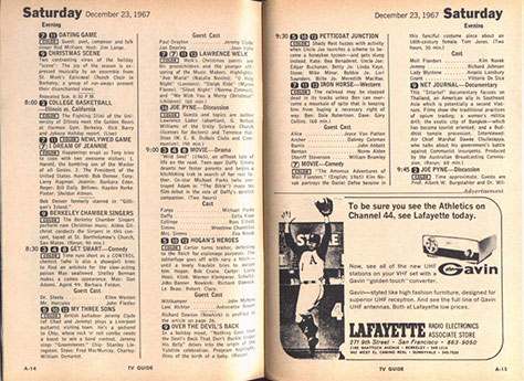
Today, a popular magazine—and yes, they still exist—sells around 3 million paper copies a week. From the 1960s through the 1990s, TV Guide was so popular that they sold 20 million copies a week of what was not much more than a database dump of ads, as Figure 4 shows, for which they actually charged people.
Figure 4—A 1967 spread from the print version of TV Guide
However, almost immediately, the people who published TV Guide realized that their main product was not a magazine. They had a data product. So they resold the same data to newspapers and others who provided local programming guides, but lacked the staff to create the data for them.
A few decades later, with the advent of the first Electronic Programming Guide (EPG)—the programming-guide channel that appeared when the user first turned on an early cable-TV system—they had the data all ready for it. The content we see today on our much more high-tech cable, satellite, and streaming systems not only has the same basic format, but is exactly the same content.
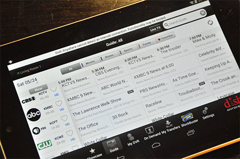
TV Guide had the concept of metadata well before anyone called it that. They had already been storing short and long descriptions—reruns within the same week didn’t get the full description—maybe space was an issue—so there was no need to write a new description for a Lawrence Welk show every time it aired. They can still pull the original description that someone typed in 1979 from the database and use it today for a streaming TV service on a digital tablet, as shown in Figure 5.
Figure 5—Programming guide for a streaming TV service on a tablet
It’s all just data. TV Guide realized that programming data was their business, not publishing a print magazine.
Platforms and Technologies
Part of your IA design work should involve processes, sensors, and storage. You should know what data is local, what requires a live connection, and what comes from the environment—for example, the user’s current location. Only then can you start to determine what technology would provide the best solution. For example, I very often refrain from suggesting a native mobile app because so many products require live access to remote data sources, for which a Web site or Webview app is best.
If you need access to technology such as a mobile phone’s camera or custom Bluetooth commands, you need to create a native mobile app. Every product is unique and technology changes all the time, so always be careful in determining the right technology.
Templates
Once you’ve settled on a platform—or several—you can begin to create templates for various types of pages. Not designs for each page, but templates that you’ll reuse as much as possible. You must still respect the information you discovered earlier and continue to design the product organically, letting it evolve into something that meets the needs of both the business and your customers. When designing the page templates, merge what you’ve learned from UX research with what you know about the platform.
Returning to the principles of industrial design that I shared earlier, leverage the materials instead of disguising them. Flat design was an overreaction to the artifice of skeuomorphism, but the following good principles of authentic digital design are useful—especially for mobile devices:
Use default behaviors, inputs, and components whenever possible.
Never build what you can borrow or link to with intent.
Don’t make users select or enter information you already know.
Respect user-entered data.
Understand and leverage viewports, scrolling, and z-axis—digital is not flat, but layered and stacked.
Consider the environment in which users may work.
Understand how users work with their devices and how they expect their devices to work for them.
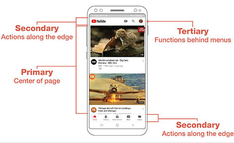
For example—expanding on that last point—on mobile devices, we know people read the center first; the edges later—and only when they want to change views, go back, or perform a task. Simply reordering the information or functions on a page into a hierarchy of three levels, as shown in Figure 6, lets you assign the information to three areas of a page.
Figure 6—A hierarchy for mobile template creation and page design
Defining this hierarchy early on—abstractly, for the whole system—lets you create reusable components and just a small number of templates. This makes your app or Web site consistent and predictable for the user. Even as content or controls change on individual pages, users know there will always be a title, that immediate actions are here, tabs to switch views are there, and less-used controls to access account information or settings are on the menu.
Once you’ve completed the templates by leveraging organic needs and authentic principles, your design is practically finished. Then it is easy to build the actual pages. It is often practical to do a first round of coding with little or no extra design work—especially if your developers have been involved in the design process from the beginning. The developers simply load the content or functionality into the templates you’ve defined for each page in the task-flow diagram.
Design for the Real World
Many boring, old industries have long taken a customer-centric approach to product design. The learnings of companies that make construction equipment, trucks, engines, and more—which they might have gleaned from customer requests, analyzing why the broken equipment customers have returned under warranty is breaking, and going into the field to observe how their products are working—drive the design of new products.
It is high time for digital-product development to catch up to the 20th century way of doing things. Gather information rather than falling prey to your biases, rushing to catch up with the competition, or following trends that won’t help you.
Design solutions before building them. Organic design lets you create products that work well for your organization, your product, your platforms, and your users. Plus, authentic digital design is generally easier to implement and more natural to use.
Revisiting Charles Harrison once more:
“Remember that your purpose—your gift to the world—is to provide straightforward solutions to real problems for living, breathing human beings.”
For his entire 15-year design career, Steven has been documenting design process. He started designing for mobile full time in 2007 when he joined Little Springs Design. Steven’s publications include Designing by Drawing: A Practical Guide to Creating Usable Interactive Design, the O’Reilly book Designing Mobile Interfaces, and an extensive Web site providing mobile design resources to support his book. Steven has led projects on security, account management, content distribution, and communications services for numerous products, in domains ranging from construction supplies to hospital record-keeping. His mobile work has included the design of browsers, ereaders, search, Near Field Communication (NFC), mobile banking, data communications, location services, and operating system overlays. Steven spent eight years with the US mobile operator Sprint and has also worked with AT&T, Qualcomm, Samsung, Skyfire, Bitstream, VivoTech, The Weather Channel, Bank Midwest, IGLTA, Lowe’s, and Hallmark Cards. He runs his own interactive design studio at 4ourth Mobile. Read More