When I started speaking and writing about mobile design, I led every talk with some charts about market share, installed base, and usage rates. I helped organize one of the first mobile-specific conferences, but whenever I went elsewhere, it was necessary to explain that mobile was already huge and a massive opportunity.
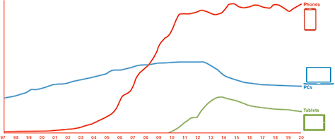
That’s no longer true. The growth of mobile-device penetration is no longer massive because it’s already happened, as you can see in Figure 1. The mobile market is not just huge; it is everything.
Champion Advertisement
Continue Reading…
Figure 1—Installed base of mobile phones, personal computers, tablets
But don’t think of mobile users as different from computer users. The sharp growth of mobile has been going on for 17 years. In fact, this has been going on for so long that you can assume almost everyone’s grandmother has a mobile phone with Internet access.
Check out personal computers (PCs) in that graph in Figure 1. The installed base of desktop and notebook computers has been dropping for years. But that doesn’t mean everyone is less connected. Even in the US, people use mobile devices more and more for their everyday tasks. The computer is now a specialized machine. Today, almost no one has a printer at home.
Mobile devices—especially phones—have taken over as our primary communications and connected-information devices.
More importantly, the traditional computer, with mouse and keyboard, might have been a temporary anomaly. While some people are keeping their computer around for certain types of work, we no longer expect everyday people to have access to a computer. Use and interaction paradigms have already shifted. Let’s look at how.
What Is Mobile Anyway?
When I say mobile, that is not as simple a category as you might think. Different groups and individuals have their own opinions about what mobile means, and the world is changing, so I’ll define the word now.
Smartphone
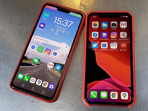
One of the more common assumptions is that mobile means a touchscreen smartphone—something like those shown in Figure 2.
Figure 2—Android and iOS smartphones
Most people have an Android phone. Android holds a bit over half the US market and closer to 75% of the installed base worldwide. It barely matters which manufacturer makes these phones—in the same way you barely care who made your Windows PC. The hardware matters, but the underlying OS is the same, and pretty much every app runs on any device of the same age.
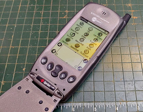
This was not always true. The market took a long time to settle into its current shape. For example, it took fully six years after the iPhone launched before iOS overtook the then ubiquitous Nokia Symbian S60 OS. Plus, perfectly good Blackberry and Windows Mobile devices hung on with good market share for several more years—especially in some regions. Why? Because the smartphone didn’t burst onto the scene fully formed. It went through some transitions, and there were multiple solutions to the problem. The first smartphone, shown in Figure 3, was usually called a PDA phone.
Figure 3—Kyocera 6035, the second PDA phone sold in the US
The Personal Digital Assistant (PDA) was a touch device—though people generally used it with a stylus or pen—with a user interface similar to today’s mobile phones. But PDAs did not connect to a cellular network, and users had to dock them to a computer to sync. When the first mobile phones became smart and acquired the PDA elements, marketers quickly started marketing them as smartphones to differentiate them from other device types.
Feature Phone
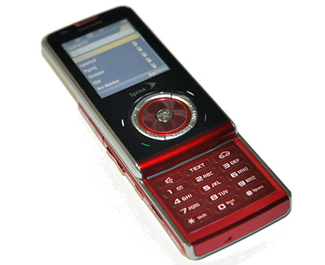
Today, almost everyone in the world has a mobile device. Still, fully half of them are not smartphones. Early cellular mobile phones only made phone calls. But, fairly rapidly, manufacturers added SMS (Short Message Service) text messaging because it was baked into the network itself—originally as a way to send messages internally or for testing. By 2002, phones provided access to the Internet, with what soon became perfectly good Web browsers, and many had cameras. Within a more few years, phones had additional features such as GPS receivers, faster Internet access, Bluetooth, and Wi-Fi. These phones were called feature phones to differentiate them from plain old mobile phones—what people would later derisively call dumb phones. Figure 4 shows a common feature-phone form factor.
Figure 4—A typical feature phone
All feature phones use proprietary operating systems that the manufacturers of the phones developed rather than a common operating system such as Android or iOS. It is not usually possible to meaningfully update the software on a feature phone. However, users can install apps on them. In many ways, the feature phone–app ecosystem is simpler than the smartphone ecosystems we have today, because almost every app works on almost every phone.
Many of today’s feature phones come with common apps preinstalled—such as social networking, email, or maps apps—or with shortcuts to a browser. Users of feature phones have not been left behind. They can connect to key Internet services through their mobile phone just as the users of other phones can.
Most project teams, UX designers, and even governments are quite dismissive of this half of the world, but we shouldn’t be. These devices tie the world together and have formed the foundation of many very large scale, profitable projects. Your product could probably benefit from working on feature phones—at least in some way.
Tablet
Most consider iPads an entirely separate market from phones, but they’re also clearly mobile because of the way people use them. People carry tablets around, work with them while standing—unlike the way they use notebook computers—and the way they interact with them is a direct extension of the way they use mobile devices.
Notice that I just said iPads. “Everyone knows” iOS has won that market, and there are almost no Android tablets. At least that’s all I hear from technical writers, who discuss how awesome the new iPad keyboard is. And it’s what I hear when I try to buy one at the local discount-computer bodega.
But, very often, what your gut instinct tells you and what “everyone knows” is flat wrong. Android actually sells about 60% of tablets as well—and that is just pure Android. Plus, there’s another entire class of devices called Chromebooks. For whatever reason, most sources classify them as computers, but a huge percentage are in tablet form factors, perhaps with a dockable keyboard.
Chrome OS is a very minor offshoot of Android. These are touch-first devices, running a major smartphone OS. They are a big deal, too. If you count them as computers, they are at least one fifth of all PCs sold, and there are quarters when they’re up to 40% of the market. These are big numbers. If you considered them as part of the tablet market, Google would own over 70% of that market.
Personal Computer
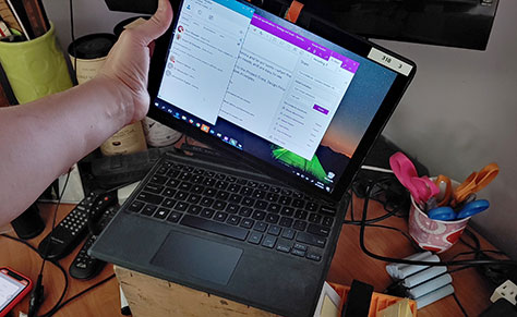
Many notebook computers are no longer any such thing. They undock or fold up to turn into tablets or other types of touch-first devices. My Windows PC is shown undocked from its keyboard in Figure 5.
Figure 5—A Windows PC convertible tablet
There are fairly few classic notebook PCs anymore, with the exception of Apple’s offerings. Windows computers and Chromebooks, if you count those, are mostly either tablets with an optional keyboard or have a keyboard that folds all the way around, allowing users to carry them like a tablet.
While the figures are a little hard to nail down, around 60% of the notebook computers that have been sold in recent years include a touchscreen. Using them is also often very much like using a tablet. People carry these around and use them in their hands.
Even at a desk, people often tab their way through a spreadsheet, mouse into the ribbon to do some formula selection, then reach over and tap the screen to dismiss a dialog box or switch to another application.
Even some desktop, all-in-one computers have touchscreens, and people use them in much the same way as they do tablets. Touch is everywhere. How did this happen?
The History of Touch
SAGE—Semi-Automatic Ground Environment—was a giant system of networked computers that combined radar detection, radios, and command centers. The US Air Force used SAGE to sense and coordinate their response to any expected enemy attacks by bombers, then later missiles. It was, in fact, the first real computer and worked full time. They turned it on and left it on for decades. Developing it created the entire field of software engineering, analysis, and project management.
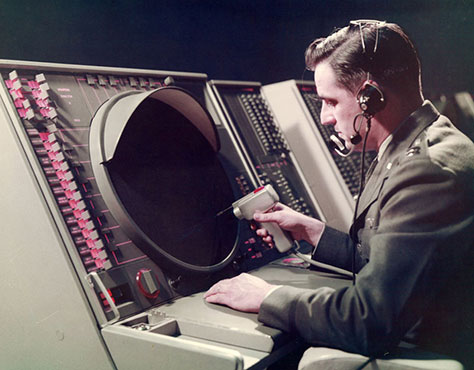
The semi-automatic part means the computer did many tasks that people had previously done manually—such as plotting the positions of radar-tracked missiles. In 1958, an operator could select an item with a light gun, as shown in Figure 6, then the computer provided more information. Plus, it could perform contextual actions on the selected item—such as vectoring a fighter plane to a target without manually copying or reading back the data.
Figure 6—A SAGE controller selecting items on its screen
How did the operator select a target? Through direct manipulation of items on the screen. A trackball was in use as early as the 1940s, but in secret or specialized places, and the device was rediscovered several times. Douglas Engelbart did not invent the mouse until he created his Mother of All Demos in 1968.
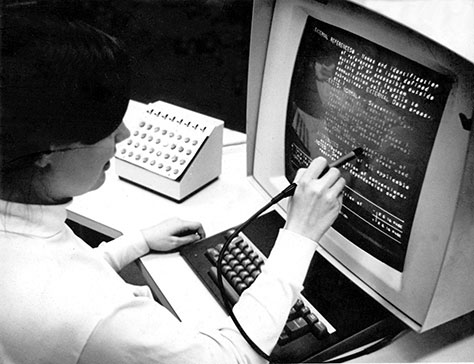
Instead, for the first few years, the SAGE operators used light guns—then later, light pens. Over time, the light pen evolved and, by the late 1960s, light pens were in use on reasonably modern-looking systems for tasks for which we use touchscreens today. In the 1960s, the Hypertext Editing System that is shown in Figure 7 was not just a prototype, but a shipping product that people used on a computer terminal to do work such as editing Apollo program documents.
Figure 7—Selecting text with a pen using the Hypertext Editing System
In 1983, Hewlett-Packard released the HP150 with a touchscreen, which people used for basic pointing when using a text-editing system. Touchscreens made their way into consumer products such as automotive infotainment systems, starting in 1986.
The mouse remained an obscure, expensive pointing device until Apple Computer shipped it with the first Macintosh in 1984. Windows 3.1, the operating system that caused everyone to switch away from command-line interfaces—for which the user had to type commands into the computer to do everything, instead of clicking to select objects on the screen—and resulted in the mass adoption of the PC, came out only in 1992.
The WIMP—Windows, Icons, Mouse, Pointer—user interface has been mainstream only slightly longer than the Web. Throughout the existence of direct-manipulation systems, pens, then touchscreens have improved and become more broadly available.
The Normal Computer
What we generally consider a normal computer might simply have been an anomaly, or accident, of history. The technology now supports the pre-mouse methods of direct-manipulation user interfaces without the last two elements of the WIMP concept: the mouse and pointer. Windows—the concept of movable application frames, not the operating system—now seem unimportant as well—at least on smaller screens.
Consider the mass of mobile devices in the world and the ubiquity of their use. Mobile methods of interaction are now much more common, so are arguably the new normal for computing. We need to stop assuming that desktop-PC design principles apply to every product. Let’s consider a few things that can help you create good products for users working with mobile devices.
Respect the Users
Do not assume that the people who use your product are poor, ill informed, or stupid because they use some device other than the one you use or use it in a different way.
You must find out what device your users use, why, and how. You should no longer assume that some users are mobile, while others use a desktop computer. Untrue tropes—such as iPhones are for cool people or rich people and PC people like spreadsheets—are not helpful and can actually be discriminatory.
Start building products for all platforms. Think about how your designs would work on platforms other than your favorite platform—and on all platforms in the future. This means planning for every method of interaction, on all devices. Everything from phones to PCs should support touch, mouse, and keyboard.
Make Everything a Mobile Device
The world is migrating to mobile form factors and methods of use. Since you cannot tell how users might employ their device, and they might switch between mouse and touch at a moment’s notice, assume everything has a touchscreen.
More broadly, assume everything is a mobile device. Therefore, you should design everything to function
as a glanceable user interface—People are distracted—both because they are tied to information at all times and because they might be moving or otherwise interacting with the real world. Glanceability means users might look at a device’s screen or your app’s part of the screen for only a moment. Make things easy to find, group them sensibly, and do not move them around. Make text easy to read and persistent. Avoid toast messages or other disappearing information.
on the go—Ad hoc work environments have noise, crowds, and poor lighting conditions. Don’t rely on sound or color to alert the user. Glare or poor viewing angles could cause colors to disappear or even change.
with touch—Make the user interface large enough to interact with safely and effectively using touch. Touch-friendly user interfaces work fine for mouse devices and trackpads as well. Providing whitespace around touch targets ensures easier reading as well.
Provide Universal Access
Everyone must be able to use every system. Whether you’re making typical user-interface design decisions or accommodating a temporary or permanent disability, keeping this in mind is crucial to your planning, design choices, and overall approach to solving problems.
A great way to tell whether you’re meeting many of the requirements I’ve described in this article is to perform an accessibility check. Check whether the screen is readable when vibrating or when in grayscale. View user interfaces in both orientations. See whether you can control all inputs using a keyboard, remote pointer, and touch. Try using accessibility modes that let the device read user-interface elements, checking that they’re all built semantically and that all labels are correct.
Design and build systems not just for the ways you’ve always done things, how you work, or how you think things should be, but for the way the world really is today and will be tomorrow.
I get your point about mobile devices being widespread, but many people I know still have grandmas, even aunts and uncles, without smartphones. I guess that’s a user group that isn’t included in the graph.
For his entire 15-year design career, Steven has been documenting design process. He started designing for mobile full time in 2007 when he joined Little Springs Design. Steven’s publications include Designing by Drawing: A Practical Guide to Creating Usable Interactive Design, the O’Reilly book Designing Mobile Interfaces, and an extensive Web site providing mobile design resources to support his book. Steven has led projects on security, account management, content distribution, and communications services for numerous products, in domains ranging from construction supplies to hospital record-keeping. His mobile work has included the design of browsers, ereaders, search, Near Field Communication (NFC), mobile banking, data communications, location services, and operating system overlays. Steven spent eight years with the US mobile operator Sprint and has also worked with AT&T, Qualcomm, Samsung, Skyfire, Bitstream, VivoTech, The Weather Channel, Bank Midwest, IGLTA, Lowe’s, and Hallmark Cards. He runs his own interactive design studio at 4ourth Mobile. Read More
