As the title of my column Enterprise UX suggests, I typically share insights for UX professionals working within large enterprise environments, which provides material for diverse topics. However, with COVID-19 shaking up everyone’s lives in 2020, I thought I’d shake up my final column of the year a bit by injecting some fun into it. (We could all use a little more of that, right?)
This fall, as I sought opportunities to facilitate constructive play with my two sons and reduce their screen time and mine, I discovered inspiration in a box of LEGO® toys—specifically, the building instructions that came with it. As I read through the booklet, I found myself comparing its simple, effective workflow to the experiences that UX designers endeavor to create. So, in this column, I’ll share some inspirational lessons that I learned and provide some ideas for how you can apply them in your own work.
Champion Advertisement
Continue Reading…
Principle 1: Projecting an Aspirational Vision
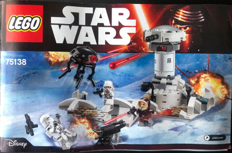
LEGO wasn’t shy about projecting an aspirational vision on the booklet’s cover, as Figure 1 shows. Consider this imagery. Once the builder has constructed the toy, will it set off mini explosions amidst the snowy and unforgiving elements of Hoth—a fictional planet from the Star Wars universe? Will laser beams and other projectiles start jetting across the room? Will the imperial probe droid levitate on its own? Of course not—but who cares? LEGO understands that fueling young builders’ imagination by using fictional imagery increases their excitement about purchasing a toy and, later, their anticipation as they unbox and construct it.
Figure 1—LEGO instructional booklet’s cover art
Applying This Principle to Your Work
If a vision for a product or experience strikes, do not keep it locked inside your head. Write it down, sketch it, or even apply your UI design skills to create a high-fidelity representation of it. Often, people don’t know what they want or would excite them until they see it, feel it, hear it, touch it, or even interact with it. You must foster this excitement within them.
Several years ago, my company funded a design project because my team had a vision of what a flagship software application could be if we gave it a more modern look and feel and revamped its workflows to take advantage of modern interaction paradigms. No senior vice president or director asked us to do this work. Our team designed high-fidelity mockups and created a presentation that showed the current state of the application versus the aspirational state that we had envisioned, even factoring in touch interactions and various functions that are rare within the domain of industrial automation.
The result? Executives couldn’t deny our vision—especially after seeing how it compared to the product’s current state and those of competitors. The work that we initiated created a groundswell of interest, and the company eventually granted the funding necessary to make it a reality.
Boldly project your vision and make it concrete. Within large enterprise environments, there are already enough forces at play that counteract creativity and imagination. Do not contribute to those forces. Follow LEGO’s lead by creating an aspirational vision. Show how things could be. Your aspirational vision could open the door to countless possibilities—and maybe you’ll even get the funding you need to realize your vision! Fuel executives’ desire to purchase your idea. Inspire your engineering and development teams to want to unbox and construct it.
Principle 2: Breaking Down a Workflow into Attainable Steps
LEGO’s building instructions are efficient and unambiguous. After all, the company can’t afford inefficiency or ambiguity because so many builders of its toys are children, who would easily become frustrated and might disengage at the first sign of difficulty. LEGO facilitates workflows that have attainable steps by doing the following:
providing an overview
foreshadowing the end result
simplifying individual steps
Let’s first look at each of these principles in turn, then I’ll share how you can apply all three to your work.
Providing an Overview
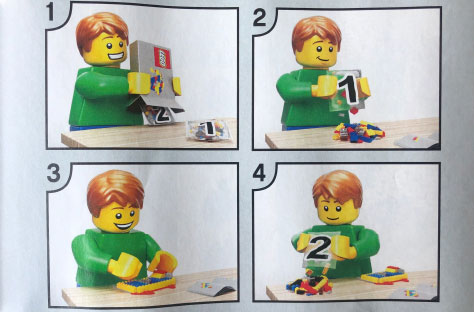
LEGO packages complementary building pieces into individual bags so builders do not have to pick through hundreds or thousands of unrelated pieces to find what they need. This is especially important for larger, more complex sets of parts. LEGO conveys this breakdown of work to its builders through a simple overview illustration, as Figure 2 shows, in which a cheery LEGO figure is performing the following high-level steps in sequence:
Unboxing the individual bags
Opening Bag 1
Assembling the pieces from Bag 1
Opening Bag 2
Figure 2—An overview page shows the high-level steps for completion
This overview of steps imposes a narrative that gives builders a sense of what to expect and helps them organize their workspace—and thoughts—before they invest their time and energy in building the toy. This also helps builders avoid the frustrating and undesirable outcomes that would occur if they were to open multiple bags at once or to construct the pieces from each bag out of sequence.
Foreshadowing the End Result
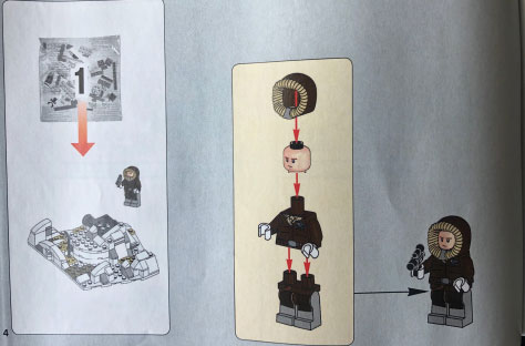
As I described in “Building Narrative into Your User Interface, Part 1,” this narrative helps foreshadow what done looks like for builders, so they experience less anxiety and uncertainty about where their work is leading them. LEGO helps orient builders to the final goal of each high-level step by showing how the bag for each step relates to a completed section of the toy, as the inset illustration in Figure 3 shows. The builder sees this depiction of the state of completion before snapping together the first two pieces.
Figure 3—A step depicting a completed section of the toy
Simplifying Individual Steps
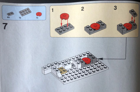
It might seem efficient for LEGO to save paper and cram more information onto each page of their instructional booklet. But, putting concerns about the environment aside, LEGO understands that having more steps of instructions with simpler content provides a more satisfying construction experience. If LEGO were to overload each page with too much instructional content, proceeding to the next page would become more cumbersome for builders, which would reduce their momentum and impose a psychological tax.
While LEGO could clutter each page with written instructions that would support their visuals, as Figure 4 shows, there are no alphabetical characters in LEGO instructions—just numbered steps, depictions of individual pieces with annotations that indicate the number of each type of piece, and directional arrows that show how the pieces fit together.
Figure 4—A page for an individual step
This simplicity is not easy to achieve. LEGO must not only understand how each piece fits into the completed toy, they must accurately and succinctly communicate this information to builders—many of whom are children, with novice reading skills.
Applying All These Principles to Your Work
“Perfection is achieved when there is nothing left to take away.”—Antoine de Saint-Exupéry
While breaking down a workflow into attainable, comprehensible steps seems like common sense, it is surprising how often designers ignore this principle—as many of the products we use every day demonstrate, whether these products are digital, physical, or a combination of the two. Instructional designers might assume that verbose, monolithic instructions are necessary because they did not rigorously endeavor to understand how a user would unbox or set up a product. As a consequence, users experience all of the resulting inefficiencies.
If you are uncertain about how to design an efficient setup or onboarding workflow for the users of your products or services, consider doing the following:
Provide an overview showing how users should complete the work before they begin doing it. It’s often necessary to show people what to do. Do not force users to guess or formulate their own narrative for how to complete a workflow—because they will. Humans are imaginative, but they also have only so much patience, motivation, and cognitive capacity to apply to a task. Set the proper expectations up front, allowing users to offload unneeded mental capacity and helping them to organize their workspace and thoughts.
Foreshadow the end result by conveying to users what done looks like. This reduces users’ anxiety, makes them more motivated to begin a task, and ultimately orients them toward their goal—and success.
Keep each individual step along the way simple. Take away all instructions that are unnecessary and present only those that are truly necessary to facilitate the reader’s comprehension and productivity, propel users through their tasks, and further fuel their motivation and confidence.
Remember, an onboarding or setup workflow is a tone-setting experience. This is the first workflow with which users interact, so it is critical to remedy any deficiencies that could result in users becoming frustrated with a product or service and potentially cause them to abandon it altogether.
Principle 3: Adding a Human Element
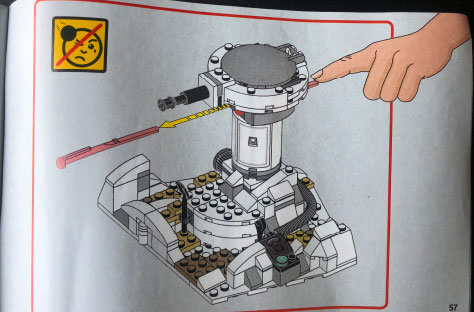
Once the builder has assembled certain parts of the toy that include interactive components, LEGO often indicates their usage by depicting a human interaction. Figure 5 shows an illustration of a human hand, with its finger extended and depressing a trigger component that launches a projectile.
Figure 5—A page that depicts human interaction with the toy
LEGO could have simply used a directional arrow to point at the trigger component and demonstrate its use, but they chose to use a human hand that is stylistically different from what builders have seen elsewhere in the instructional booklet. Why did LEGO bother? What are the benefits of adding a human element? Consider the following:
The hand connects builders to the toy in a more visceral way than a directional arrow or some other artificial indicator would have.
The hand favors human psychology. People relate better to a product or service when we can see someone who is like us interacting with it. This activates the subconscious part of our brain that craves reassurance that something is safe or normal to use—even if that something is a child’s toy.
Applying This Principle to Your Work
When I worked at Progressive Insurance, the company would often balance photography of Flo, the insurance cashier, with photography of people in their natural environment, using products that the company insured. Such imagery often appeared on the main product pages of the Progressive consumer Web site, and the company refers to it as lifestyle photography. In fact, the company—and many similar financial-services companies—still heavily employ this type of imagery, as Figure 6 shows.
Figure 6—Lifestyle photography on the Progressive Insurance Web site
While it would have been easy—and even logical—to show the beautiful, mountainous vista with a partially cropped car in the foreground, Progressive chose a candid shot of a happy couple leaning against the car, physically connecting them to a product that the company protects.
How does this relate to the depiction of the human hand in the LEGO instructional booklet, which is of course instructional? As I mentioned earlier, designers can support users’ needs to feel normal, safe, and protected by showing how they connect to a product or service. Think about the products or services you design. Are there places where you could layer a human element into an image to reinforce users’ connection to it? Remember, humans respond to depictions of their own likeness on a more primal level—often without their being aware of it.
Conclusion
LEGO knows its users well, and their instructional booklets reflect this. Apply these principles to your own work:
Principle 1—Project an aspirational vision to fuel excitement and anticipation in your product or service’s users.
Principle 2—Break down your users’ workflow into attainable steps, by doing the following:
Give users an overview of their workflow so they can organize their workspace and thoughts before they set to work.
Foreshadow the end result of a task to reduce users’ anxiety and uncertainty, which also helps orient them to their final goal.
Simplify a task’s individual steps to foster motivation and satisfaction in users as they move ever closer to the completion of their goal.
Principle 3—Add a human element to support users’ psychological needs and connect them to your product or service in a more visceral way.
Although 2020 has been a challenging year, hopefully this slight shift of topic for Enterprise UX has brought you a bit of holiday joy, while also inspiring you to use these lessons in your own work!
Director of User Experience at Rockwell Automation
Cleveland, Ohio, USA
Jon has a degree in Visual Communication Design from the University of Dayton, as well as experience in Web development, interaction design, user interface design, user research, and copywriting. He spent eight years at Progressive Insurance, where his design and development skills helped shape the #1 insurance Web site in the country, progressive.com. Jon’s passion for user experience fueled his desire to make it his full-time profession. Jon joined Rockwell Automation in 2013, where he designs software products for some of the most challenging environments in the world. Jon became User Experience Team Lead at Rockwell in 2020, balancing design work with managing a cross-functional team of UX professionals, then became a full-time User Experience Manager in 2021. In 2022, Jon was promoted to Director of User Experience at Rockwell. Read More